|
Cross Tabbing
A cross tab is the division of a single visualization into smaller multiple visualizations across either on rows, columns or both. Each smaller child visualization displays the relevant portion of the data set. It can also be called trellising, or small multiples.
The purpose of a cross tab is to allow comparison across portions of the data set.
Cross tabbing is available in the following visualizations:
|
q Box Plot q Dot Plot |
q Treemap |
Steps:
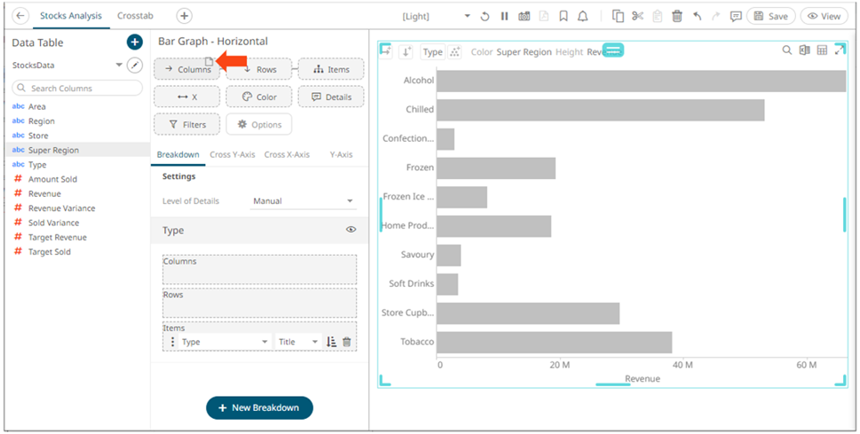
1. Select a visualization that supports cross tabbing like a Bar Graph.
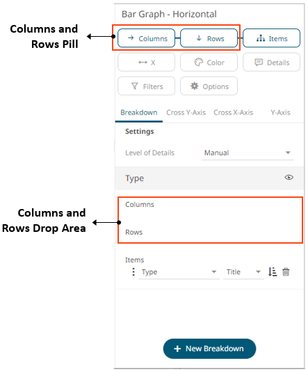
2. To add columns or rows, you can do the following:
· drag text fields from the Data Table pane to the Columns or Rows pill or on the drop area under the Breakdown tab
For example:
· or select from the Rows or Columns buttons on the visualization
This
example is selecting from the Columns  button.
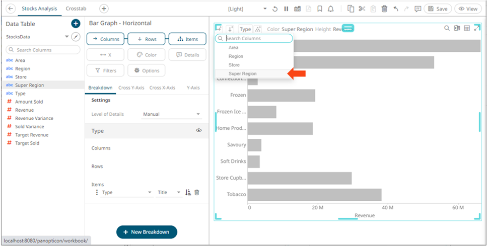
To search for a particular column, enter into the Search Columns box. You can also enter one or more characters into the Search Columns box and the suggested list of columns that matched the entries will be displayed.
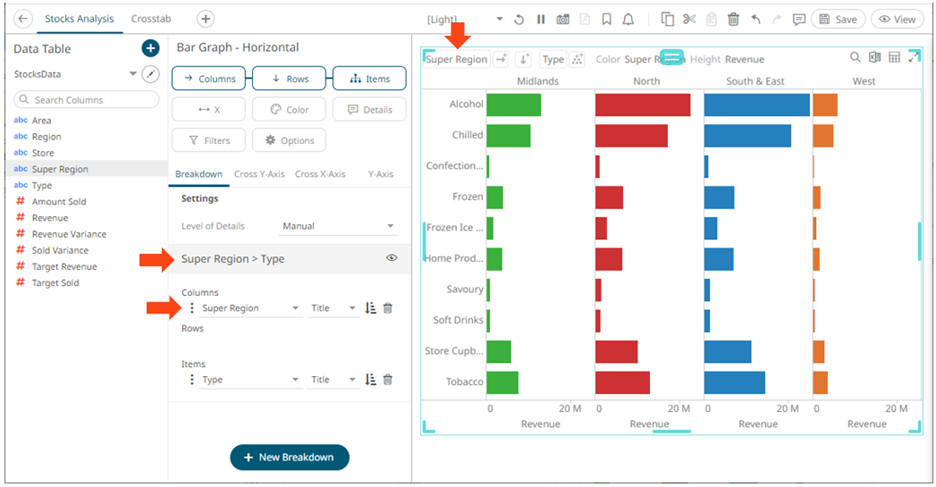
Once dropped or selected, the visualization will be cross tabbed, producing a series of smaller visualizations for each item within the column dropped.
On both instances, the new column is added under the Breakdown tab and on the visualization.
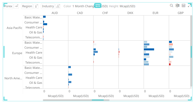
Cross tabs can be across rows, across columns, or across both where two separate cross tabbing dimensions have been selected.
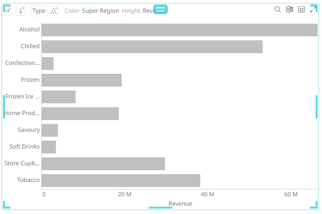
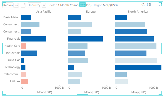
Dropping a text column onto the Columns section trellis the visualization horizontally:
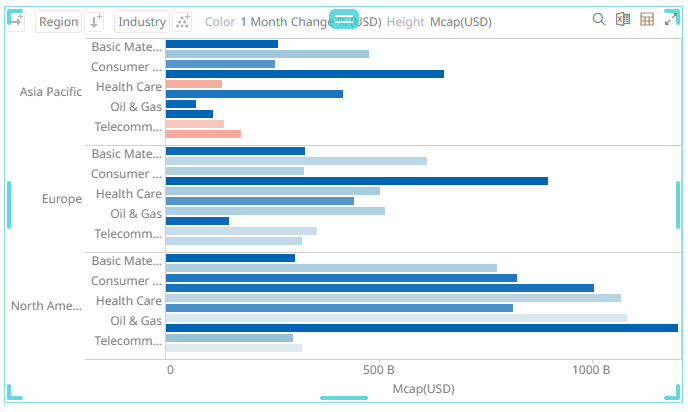
While dropping a column onto the Rows section trellis the visualization vertically:
And finally dropping columns onto both Rows and Columns produces a series of smaller trellised visuals. Each showing the specified subset of the overall data set.