


|
Timeseries Scatter Plot Settings
Time Series Scatter Plots display time-based transactions, similar to the Needle graphs. Like the scatter plot, it displays individual data points (or transactions), with a given numeric Y value and a given timestamp X value.
Common uses include displaying transaction volume across time relative to the price at which the volume was executed and displaying order book depth across time.
Typically, the graph is combined with line graphs to show the scatter points relative to defined boundaries.
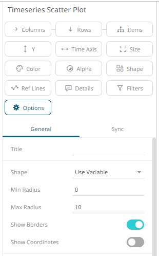
The timeseries
scatter plot settings pane is displayed after clicking the Options  button.
|
Setting |
Description |
|
Shape |
The shape of the scatter point. This can be: · Filled Circle · Circle · Filled Square · Square · Use Variable – shapes can be specified for the elements in the visualization through the Shape variable |
|
Min Radius |
The minimum radius in pixels of the scatter point. |
|
Max Radius |
The maximum radius in pixels of the scatter point. |
|
Show Borders |
Determines whether a border is drawn around each scatter point. |
|
Show Coordinates |
Determines whether the graph coordinates (i.e., X-Y plots, or Date/Time-Y plots) on mouse over are displayed in the visualization. |
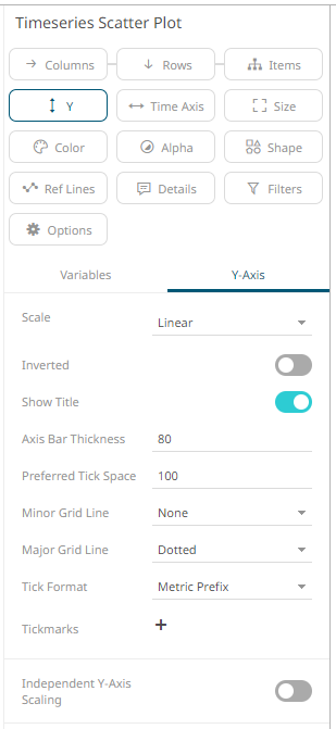
Other visualization-specific properties can be set by clicking on the Y-Axis variable drop area and then selecting the Y-Axis tab:
|
Setting |
Description |
|
Independent Y-Axis Scaling |
Determines whether to have each visualization Y-axis in a cross tab automatically scaled independent of the others. |