


|
Donut Chart Settings
Donut Charts are a derivative of the pie chart and are used in the same manner for displaying contributions to a total.
Panopticon can produce standard Donut Charts in which the donut slice represents a numeric variable that is proportional to the total size of the donut. The color variable can represent either a category or another numeric variable.
Donut Charts can be flat, showing a single set of slices. They can also be hierarchical and display multiple levels of data in a variant called a Multilevel Donut Chart.
A recommended alternative to the Donut Chart is the Treemap, which can display a larger number of data points, and is easier to compare constituent data points.
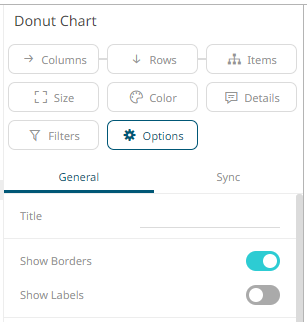
The donut
chart settings pane is displayed after clicking the Options  button.
|
Setting |
Description |
|
Show Borders |
Determines whether a border is drawn around each leaf. |
|
Show Labels |
Determines whether labels are displayed within each leaf. |