|
Pareto Chart Settings
The Pareto Chart is a combination of the Bar Graph and Categorical Line Graph, and can be used for comparing actuals to forecasts, and if the dataset is available, comparing individual to cumulative returns.
The traditional usage of a Pareto chart displays individual values in a descending order as bars, with the cumulative total represented by the line.
The pareto
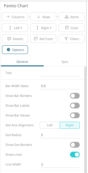
chart settings pane is displayed after clicking the Options  button.
|
Setting |
Description |
|
Bar Width Ratio (%) |
Defines the ratio of the width within the bars. Default is .5. |
|
Show Bar Borders |
Determines whether borders are drawn around bars or stacks within bars. |
|
Show Bar Labels |
Specifies whether labels are drawn inside the bars. |
|
Show Bar Values |
Specifies whether values are displayed in bars. |
|
Dot Axis Alignment |
Determines whether the dot axis is aligned to the Right or Left. |
|
Dot Radius |
Specifies the radius of each data point in pixels. |
|
Show Dot Borders |
Determines whether a border is drawn around each dot. |
|
Show Lines |
Determines whether a line is drawn between the dots category constituents. Allows a categorical line graph to be displayed. |
|
Line Width |
Specifies the width in pixels of the line if enabled. |
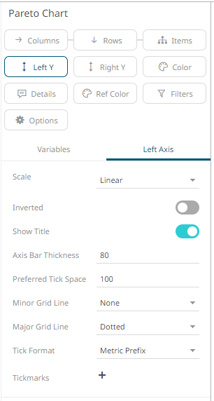
Other visualization-specific properties can be set by clicking on the Left Y variable drop area and then selecting the Left Axis tab:
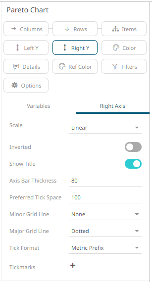
Or also, by clicking on the Right Y variable drop area and then selecting the Right Axis tab: