Preferences
Set default parameters for HyperGraph plot types.
From the File menu, select Preferences to display the panel. The options available depend on the currently selected plot type.
Session
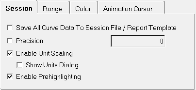
Figure 1.
- Save All Curve Data to Script File
- Saves all curve data to the session file.
- Precision
- This is generally used along with the Save all curve data to script file option. It is used to set the precision for the curve values in the session file.
- Enable Unit Scaling
- Enables unit scaling. You can also display the Show Units Dialog by selecting that option. See Enabling Units for more information.
- Enable Prehighlighting
- Enables the prehighlighting of curves. When this option is on (by default), you can hover over a curve to highlight it. The highlighted curve is displayed in gold.
Range
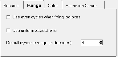
Figure 2.
- Use even cycles when fitting log axes
- By default, HyperGraph fits logarithmic curves using the minimum and maximum values of the data. Select Use even cycles when fitting log axes to fit logarithmic curves using the next power of 10 greater than the maximum and the next power of 10 less than the minimum.
- Use uniform aspect ratio
- The aspect ratio of the plot area is locked. Distances between values on the x-axis are the same as those on the y-axis.
- Default dynamic range (in decades)
- Calculates the minimum value shown when plotting non-positive numbers on a log scale. The minimum value shown is equal to the maximum divided by 10 raised to the default dynamic range. To specify a new dynamic range, enter a new range in the Default dynamic range text field or use the buttons. The default is 4.
Style
Use the Style tab to modify the style of the bars and change the gap or interval between bars.
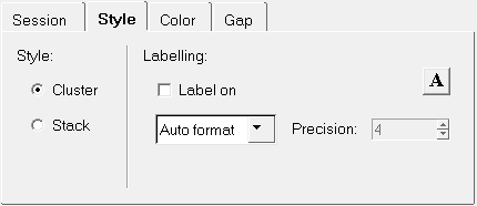
Figure 3.
- Style
- You can cluster or stack the bars within a category.
- Labeling
- You can place bar chart labels over both stacked and clustered bars.
- Click the font button,
 , to change the font attributes of the bar
chart labels.
, to change the font attributes of the bar
chart labels.
Color
Any of the 64 colors in the color palette can be assigned to plot elements such as plot background, frame, grid lines, and the zero line.
Choose a plot element, then select a color from the palette to change the color of the selected element.
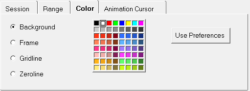
Figure 4.
- Background
- Changes the background color of the HyperGraph window. The default is white.
- Frame
- Changes the color of the frame around the HyperGraph window.
- Grid Line
- Changes the grid line color.
- Quadrant Line
- Changes the quadrant line color.
- Zero Line
- Changes the zero line color.
- Use Preferences
- Sets the active HyperGraph window's background, frame, grid line, quadrant line, zero line, header, footer, tic, and note colors to the defaults specified in the preferences.mvw file.
Animation Cursor Tab
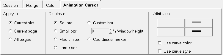
Figure 5.
- Apply to
- You can apply the animation cursor attributes to the Current Plot, Current Page, or All Pages.
- Display As
- Sets the animation cursor display type. Options include:
- Square
- Small bar
- Medium bar
- Large bar
- Custom bar - Choose the size of the bar by entering a value in the % Window height field. You can enter a value directly or use the up and down arrows to choose a value.
- Coordinate marker
- Attributes
- Select the width of the cursor line by choosing one of the four line
styles shown.
- Use curve color
- Sets the animation cursor color to that of the curve that the animation cursor is on.
- Use curve style
- Changes the line style of the animation cursor (solid, dashed, etc.) to match the curve’s style.
Gap
From the Gap tab, you can change the distance between categories of bar charts.
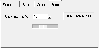
Figure 6.
- Gap/Interval %
- Changes the distance between the categories of bar charts by increasing or decreasing the width of each bar. Use the up and down arrows or the slider bar to change the gap percentage. The default percentage for clustered bars is 40. The default percentage for stacked bars is 40.
- Use Preferences
- Gap attributes can be assigned automatically to the bars and to selected plot elements by choosing the Use Preferences feature. When Use Preferences is selected on the Gap tab, the default attributes defined in your personal preference file are automatically applied. If there is no preferences file available, the application's built-in defaults are applied.
Complex
The Complex tab allows you to change the way in which complex plots are displayed.
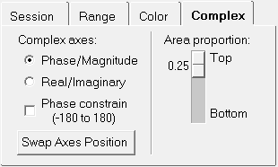
Figure 7.
- Phase/Magnitude
- Displays the Phase and Magnitude values on the y-axis.
- Real/Imaginary
- Displays the Real and Imaginary values on the y-axis.
- Phase Constrain (-180 to 180)
- Limits the range of the phase/magnitude on the plot.
- Swap Axis Position
- Select to switch the position of the y-phase axis and y-magnitude axis.
- Area Proportion
- Use the slider bar to increase or decrease the height of the plot. Move the slider toward Top to decrease the height of the upper plot increase the height of the lower plot. Move the slider toward Bottom to increase the height of the top plot and decrease the height of the lower plot.