Curve Style
Define curve attributes.
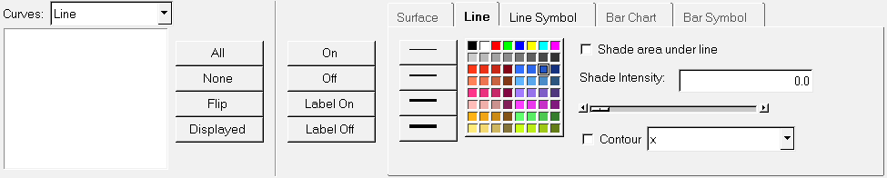
Figure 1.
Curve List
The Curve List displays the names of the curves in the current window.
From the drop-down menu, you can select the curve type: Line, Surface, Waterfall, Query Lines, or Bar Chart. This displays only curves of that type in the Curves list.
- All
- Selects every curve in the list.
- None
- Deselects all highlighted curves in the list.
- Flip
- Exchanges the currently selected curves for the unselected curves in the list.
- Displayed
- Selects the curves in the list that are currently displayed in the active window.
Curve and Label Display
Curves and legends can be displayed or hidden in the graphics window.
- On/Off
- The On/Off buttons allow you to turn the selected curves on or off in the display.
- Label On/Label Off
- The Label On/Off buttons allow you to turn curve legends on or off in the display.
Surface Attributes
Surface attributes can be assigned to curves to help differentiate curves on a plot, specifically for surface and waterfall plots.
- Display Mode

- Displays the surface shaded without lines.

- Displays the surface as a wireframe.

- Displays the surface shaded with lines.
- Display Mode

- Displays shaded waterfall slices.

- Displays slice lines only.

- Displays a waterfall as a shaded surface.
- Opacity
- Solid

- Transparent

- Contour
- Click Contour and define the contour values using
one of the following:
- Expression
- Enter a math expression to define contour values. You can use the default X, Y, Z selections or use your own math expression.
- Discrete contour
- Produces discrete color bands on contour plots with distinct boundaries between contour levels.
- Edit legend
- Click Edit legend: to edit the contour legend.
Line Attributes
Line thickness can be assigned to a curve. The line weight for each curve is displayed in the legend. Click on a line weight to change the thickness of the currently selected curves.
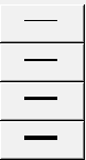
Figure 2.
Any of the 64 colors can be assigned to a curve. Select a color from the color palette to change the color of the selected curves.
- Shade area under line
- Fills in the area under the curve line with a solid color.
- Shade intensity
- If you select Shade area under line, you can determine the shade intensity by either entering a value directly or using the slider bar.
- Contour
- Click Contour and define the contour values by entering a math expression to define contour values. You can use the default X, Y, Z selections or use your own math expression.
Line Symbol
Symbols can be placed on a curve to indicate data points. There are nine different symbols available. To mark the data points on the currently selected curves, select a symbol from the symbol palette. Click None to remove a symbol from a line.
The frequency of the symbol placement is determined by the Every field. By default, Every is set to 1 so symbols are placed at each data point. To change the symbol frequency, enter a number in the Every field. For example, if Every is set to 5, a symbol is placed at every fifth data point on the curve.
You can also change the size of the symbol by using the up and down arrows, or entering a value in the Size field.
Any of the 64 colors can be assigned to a symbol. Select a color from the color palette to change the color of the symbols on the selected curves.
Bar Chart
Allows you to change the color of the bars.