|
Timeseries Combination
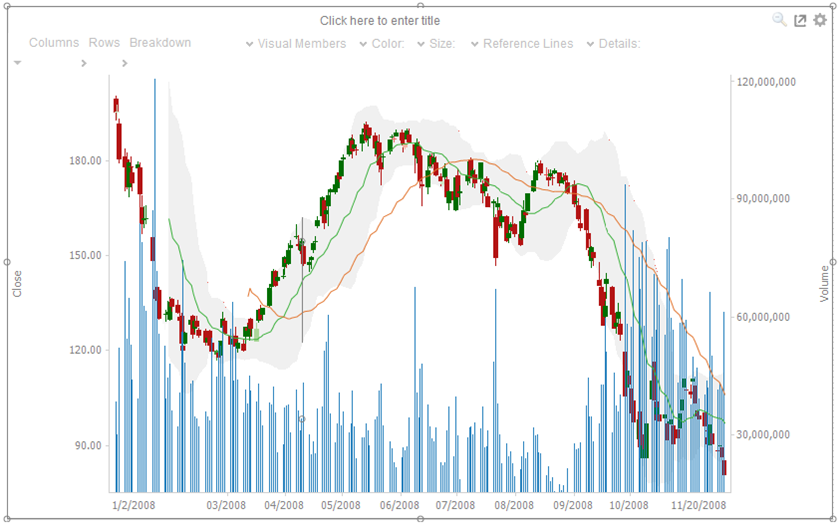
The Timeseries Combination visualization operates in a similar way to the Table. Instead of multiple input variables becoming different columns in a table, they become different layers in the time series combination visualization. Therefore, unlike other visualizations, it can display a large number of time series variables, which can be rendered as: Line, Candle Stick, Needle, OHLC, Spread, Stack & Stacked Needle.
Defining Timeseries Combination
-
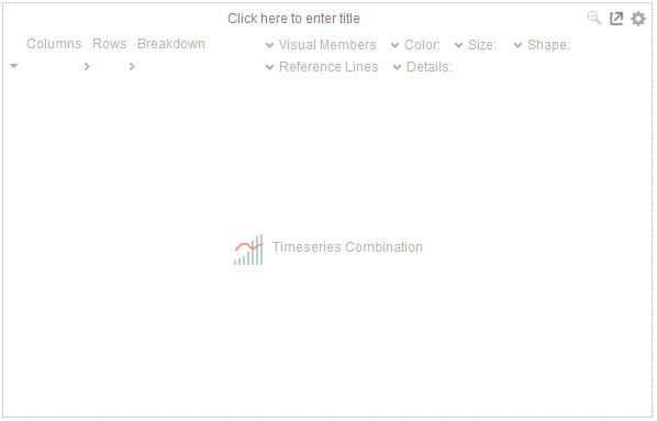
Drag the Timeseries Combination visualization table to the dashboard canvas and release.
The Table lists:
-
-
Title
-
Settings Section
-
Breakdown Shelf
-
Variables
-
-
Visual Members
-
-
Details
-
-
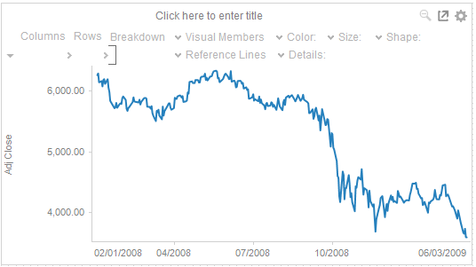
Dragging columns from the data table to the Visual Members drop area creates time series graph layers.
-
-
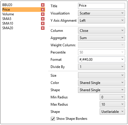
By default, each added field uses the line graph visualization and the Left Y-axis alignment.
-
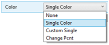
Color and Reference Lines are added as with other time series visualizations.
-
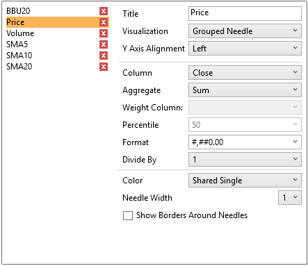
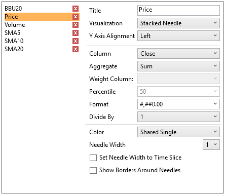
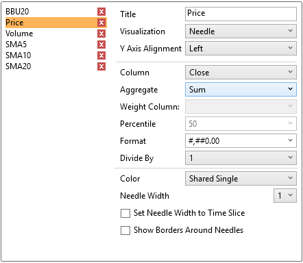
Visual Members can be set to display any of the following visualizations:
-
-
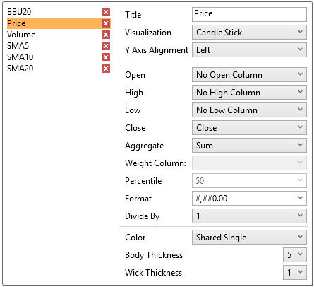
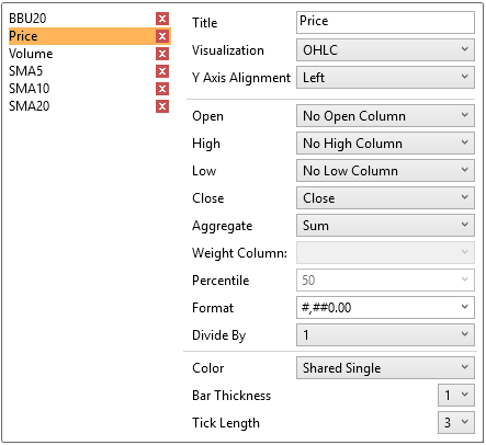
Candle Stick or OHLC
-
-
-
-
-

-
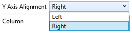
NOTE: To enable the Show Last Value and Show Last Value Title check boxes, the Y Axis Alignment must be set to Right.
-
-
-
-
-
-
-
-
-
You can assign the visual member to either the Left or Right axis.
-
-
-
The corresponding fields are displayed depending on the selected visualization:
-
-
Candle Stick and OHLC
-
Setting
Description
Open
The Open input column. Set to No Open Column if the Open input column will not be used.
High
The High input column. Set to No High Column if the High input column will not be used.
Low
The Low input column. Set to No Low Column if the Low input column will not be used.
Close
The Close input column. Set to No Close Column if the Close input column will not be used.
-
-
-
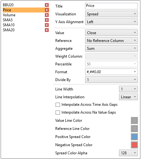
Price Band and Spread
-
-
-
Setting
Description
Value
The field that will be used as the value line data series.
Reference
The field that will be used as the reference line data series.
-
-
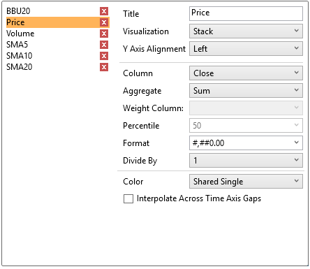
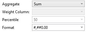
As with all visualizations, the values should have a defined aggregation method and format.
-
-
Select the Divide By value to divide a number:
-
-
1
-
1000 (by a thousand)
-
10000
-
1000000 (by a million)
-
1000000000 (by a billion)
-
-
You can also configure the visual member to display a selected color variable.
-
For the rest of the fields in the dialog, refer to the corresponding visualization settings sections for more information.
The resulting visualization can be graphically rich, allowing the visual comparison across multiple different variables.
-
-
Click on Settings on the top right of the visualization. This opens the Settings panel.
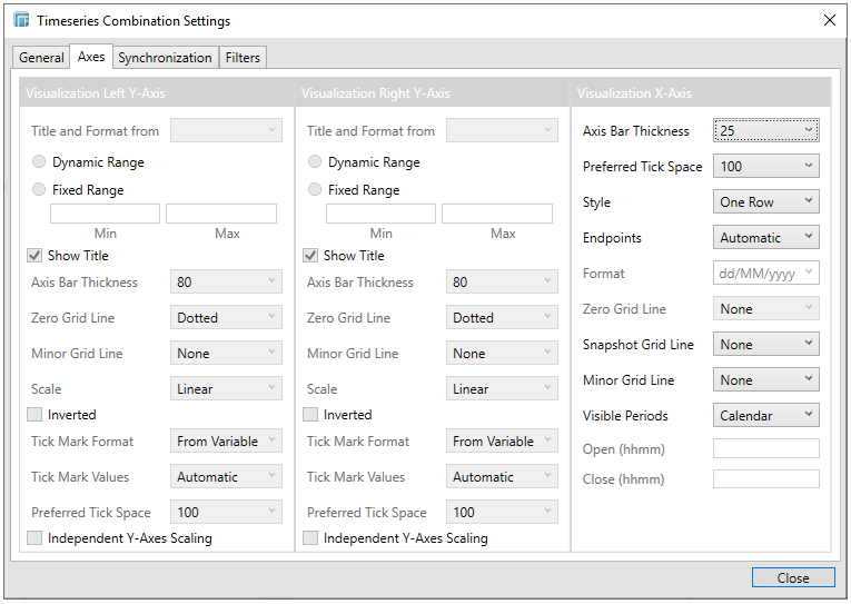
For the Timeseries Combination visualization, this includes an expanded Axes panel, which includes specification of the properties of both the Left and Right Y Axes.
|
Setting |
Description |
|
Title and Format from |
The title and format of the Left and Right Y-Axes based on the selected fields. |
|
Range
|
The visible range for the Left and Right Y-axis variables can either be calculated dynamically (Dynamic Range) or set between predetermined limits by selecting Fixed Range. This enables the Min and Max text boxes and populates them with default values taken from the data set. |
|
Show Title |
Displays an Axis Title label. |
|
Axis Bar Thickness |
The margin in pixels for the axis. If set to zero, the axis is removed. |
|
Zero Grid Line
|
How a major X axis grid line is drawn. Allowed values:
|
|
Minor Grid Line
|
How minor grid lines are drawn across the axis. Allowed values:
|
|
Scale
|
Determines whether the scale of the axis is Linear, Log 10, or Power.
NOTE: Does not support zero or negative values.
For example for values between -100 and 100, the axis will be: -100, -10, 0, 10, 100 |
|
Inverted |
Determines whether the Y or Height axis is inverted. |
|
Tick Mark Format
|
Set to From Variable to use the format string that is on the current variable displayed in the axis. Set to Metric Prefix to format the Tick labels in the numeric axes using the metric prefixes. |
|
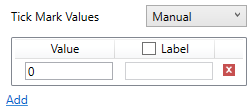
Tick Mark Values
|
Set to Automatic for automatic axis ranges or Manual to define specific tick marks. For Automatic:
For Manual:
|
|
Preferred Tick Space |
The preferred space in pixels between the minor grid lines across the axis. |
|
Independent Y-Axes Scaling |
Determines whether to have each visualization Y-axis in a cross tab automatically scaled independent of the others. |
|
Style
|
Defines that the time based axis is displayed across two rows, with the start and end points displayed on the bottom row. Allowed values:
|
|
Endpoints
|
Determines whether to display endpoints. Allowed values:
|
|
Format |
Determines the Date/Time format when the endpoint is Custom. |
|
Snapshot Grid Line
|
Defines whether a grid line is drawn showing the snapshot location. Allowed values:
When the Snapshot Grid Line is rendered, the Set Snapshot Here option will be available in the visualization context menu in the Web Client. |
|
Minor Grid Line
|
Determines how minor grid lines are drawn across the axis. Allowed values:
|
|
Visible Periods
|
Determines whether:
|
|
Open (hhmm) |
Defines what time the market opens. |
|
Close (hhmm) |
Defines what time the market closes. |