Select a method to display the path contribution data.
To activate this tab, you must have first loaded the files from the Load tab.
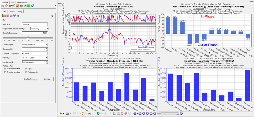
Bar
Allows you to plot path contributions to an acoustic or structural
response on a bar chart.
First, select a subcase for which TPA contributions will be plotted.
Then, select frequency or RPM from the Display path contribution by
drop-down menu.
Enter a specific frequency in the Specific Frequency field, or use the
slider bar to select a frequency value. When you use the slider bar to
select a frequency, a red line is displayed on the response plot and is
dragged simultaneously as you drag the slider bar.
Combine path
Do not combine
Path contributions are not combined.
To point (L3)
Path contributions are combined to point
(description level 3 - see Input point description
section of the Transfer Path Details - Point Tab
topic).
To component (L2)
Path contributions are combined to component
(description level 2 - see Input point description
section of the Transfer Path Details - Point Tab
topic).
To subsystem (L1)
Path contributions are combined to subsystem
(description level 1 - see Input point description
section of the Transfer Path Details - Point Tab
topic).
Show contrib.
Select the number of the highest contributors to
display.
Available numbers are 1 though 20 in increments of 1, and
All.
Optionally, you can filter path contributors to a smaller
set by clicking the Filter Contrib. dialog.
Complex component
Projected - Plots scalar participation values after
projection to the response. The positive values are in-phase
with the response and the negative values are out-of-phase.
Available for Bar plots only.
Magnitude - Plots the magnitude of the complex participation
values. Available for Bar, Sand Dune, and 3D Surface plots
only.
Magnitude-Phase - Plots the magnitude and phase of the
complex participation values. Available for Polar, 3D Polar,
and 2D Line plots only.
Abs of Projected - Plots the absolute value of the complex
participations after projection to the response. Available
for 2D Line, Sand Dune, and 3D Surface plots only.
Rank by
Abs of Projected - Contributors are ranked by the area under
the curve of the absolute values of their participations,
projected to the response.
Magnitude - Contributors are ranked by the area under the
curve of the magnitude of their participations.
Abs of Projected RSS - Contributors are ranked by the root
sum of squares of their participations at selected
frequencies projected to the response.
Magnitude RSS - Contributors are ranked by the root sum of
squares of the magnitude of their participations at selected
frequencies.
Listed order – Contributors are plotted in the same order as
they are listed in the Path Details dialog.
Identify path by
Path description – Path description is used as the path
label on the plot.
Path label – Path label is used as the path label on the
plot.
Path name – Path name is used as the path label on the
plot.
TF, force, and PM plots cannot be generated if you selected
Combine path contributions.
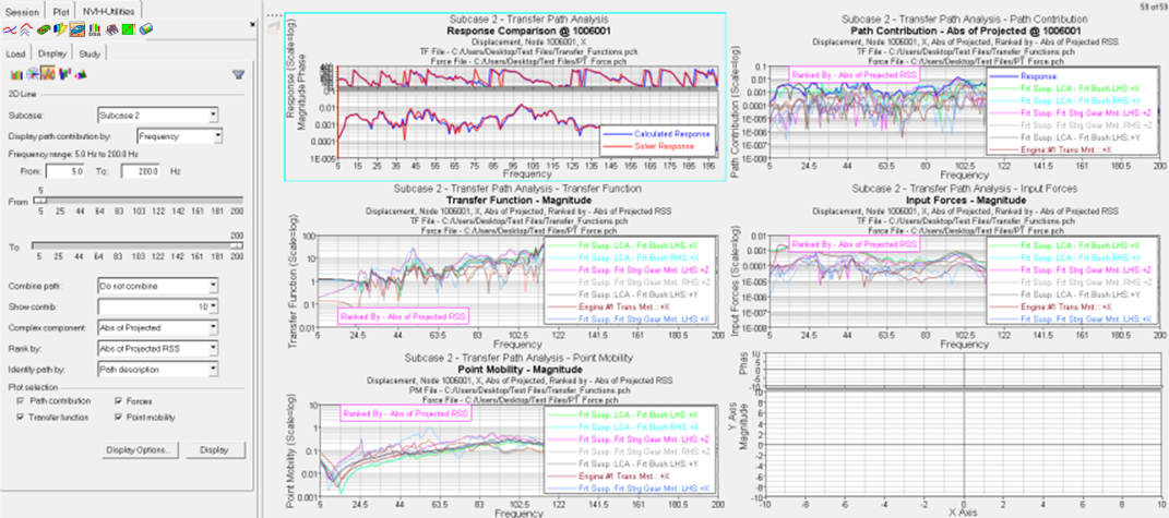
Plot Selection
Allows you to plot additional TF, force, and PM plots, along with the
path contributions plot. The path contributors are plotted in the same
order as they appear on the path contributions plot.
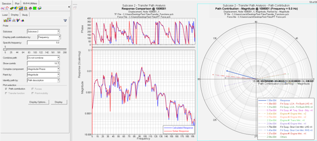
Polar
Creates a 2D polar plot of the path contributions at a specific
frequency.
Enter a frequency in the Specific frequency field, or use the slider bar
to select a frequency value. When you use the slider bar to select a
frequency, a red line is displayed on the response plot and is dragged
simultaneously as you drag the slider bar.
All other options are similar to those for the Bar plot.
2D Line
Creates a plot of path contributions to an acoustic or structural
response on a 2D line plot (overlay).
Frequency range indicates the available range, based on the frequencies
used during the transfer path analysis.
Using the From and To fields, you can customize your own frequency
band.
All other options are similar to those for the Bar plot.
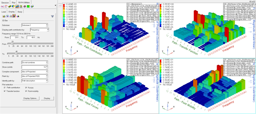
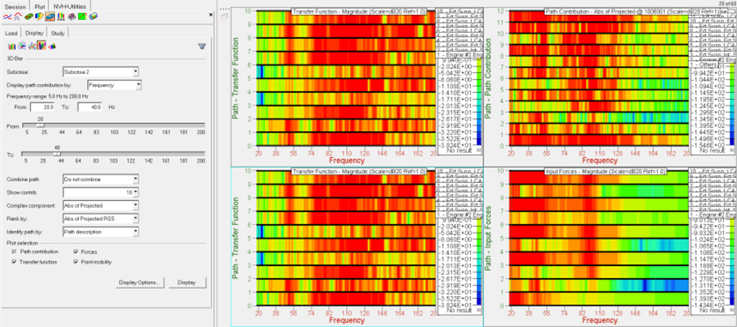
3D Bar
Creates a plot of path contributions on a 3D Bar plot.
Frequency range indicates the available range, based on the frequencies
used during the transfer path analysis.
Using the From and To fields, you can customize your own frequency
band.
All other options are similar to those for the Bar plot.
3D Surface Plot
Creates a plot of path contributions on a 3D Surface plot.
Frequency range indicates the available range, based on the frequencies
used during the transfer path analysis.
Using the From and To fields, you can customize your own frequency
band.
All other options are similar to those for the Bar plot.
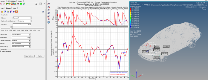
Force Vector
Force Vector plots at a particular frequency for one-step TPA
results.
Display options
The Display Options dialog allows you to customize the plot, including
scale, weighting, and the plot layout.