HG-3020: Working with Polar Plots
In this tutorial, you will learn how to create polar plots from a data file and add polar plots by using mathematical functions.
The Build Plots panel can be accessed in one of the following ways:
- Click the Build Plots button,
 , from the toolbar
 - From the menu bar select .
The Build Plots panel constructs multiple curves and plots from a single data file. Curves can be overlaid in a single window or each curve can be assigned to a new window. Individual curves are edited using the Define Curves panel.
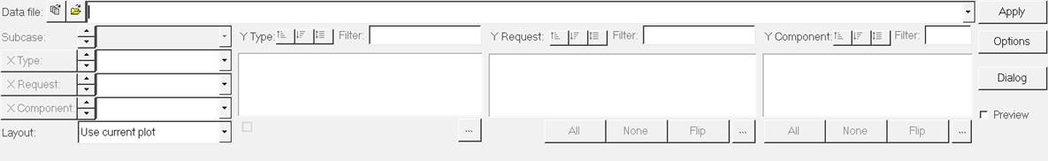
Figure 1.
The Define Curves panel can be accessed in one of the following ways:
- Click the Define Curves button,
 , from the toolbar
 - From the menu bar, select
Existing curves can be edited individually and new curves can be added to the current plot using the Define Curves panel. The Define Curves panel also provides access to the program's curve calculator.
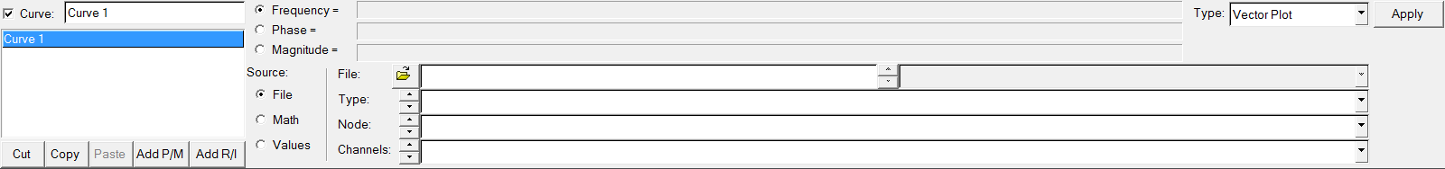
Figure 2.
Build a Polar Data Plot from a Data File
-
From the plot type menu, select Polar Plot,
 .
.
-
Enter the Build Plots panel,
 .
.
-
Click Apply to create the polar plots.
The vectors are plotted at a frequency of 100.0Hz.
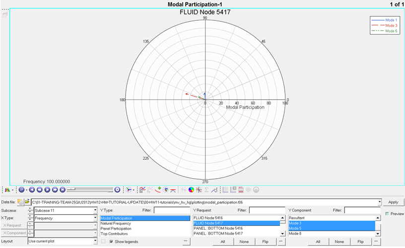 Figure 3.
 -
Select the 128.0Hz frequency and click
OK.
The vectors are plotted at 128Hz frequency.
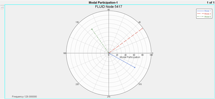 Figure 4.
Add Polar Data
-
Use the Page Layout button,
 , to change the window layout of page 1 to a two-window
layout.
, to change the window layout of page 1 to a two-window
layout.
-
Choose the 128.0Hz frequency and click
OK.
The summation vector is now plotted at 128Hz frequency.
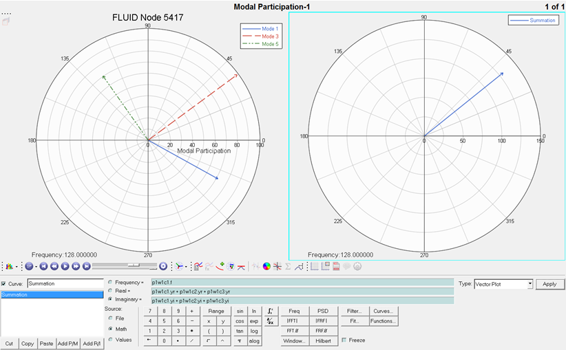 Figure 5.
 -
Change the Type: field to Phase vs Mag.
Note: A Phase vs Magnitude curve for all frequencies is shown as a line connecting the tips of the vectors at different frequencies.
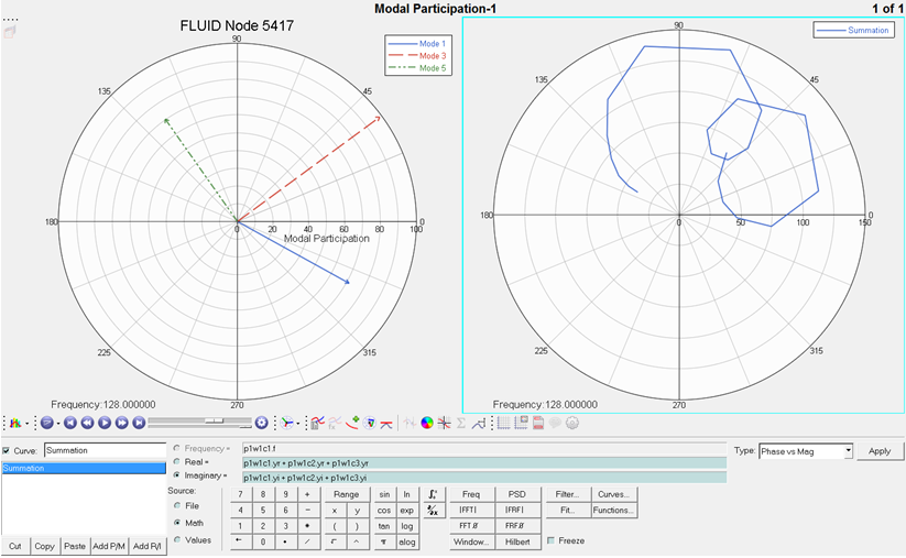 Figure 6.
 -
Click the start animation button,
 .
Note: The summation of vectors is updated in the animation for each frequency value in the list.
.
Note: The summation of vectors is updated in the animation for each frequency value in the list.