Define Curves
Edit existing bar charts individually and add new bar charts to the current plot.
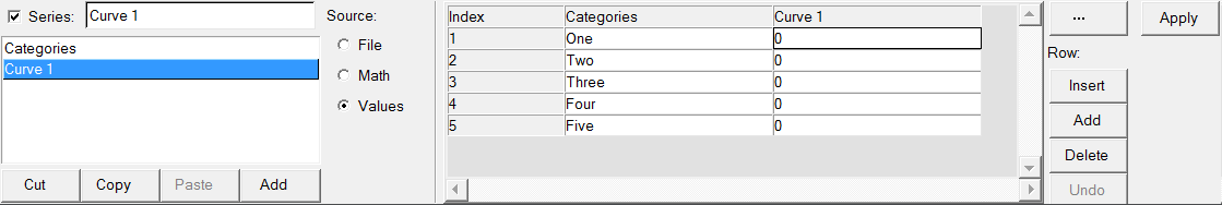
Figure 1. Define Curves panel
The curve list displays the names of all the bar charts in the active window. The Cut, Copy, Paste, and Add buttons under the bar chart list are used to maintain the bar chart list for the active window. Bar charts can be copied and pasted into other bar chart windows or within the current bar chart window. Bar charts can be also be added and deleted from the list, and they can be renamed.
Individual bar charts can be turned on or off. To turn a bar chart off, select the bar chart from the window and deactivate the Series check box next to the bar chart name. To turn a bar chart on that was turned off, activate the Series check box.
Bar charts are comprised of data and categories. Data can be read from an external file, defined as a mathematical expression, or entered as values. A label identifies categories and tic marks are used to separate them from other categories. If there are more data points than there are categories, the application adds blank categories to accommodate the extra data points. You can also plot category values using a Templex function. For example, {p1w1.category}.
Data Sources
Data can be read from a data file, defined as mathematical expression, or entered as values.
Bar chart curves are comprised of data and categories. A label identifies categories and tic marks are used to separate them from other categories.
File as a Data Source
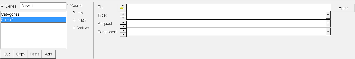
Figure 2. Source = File
Math as a Data Source
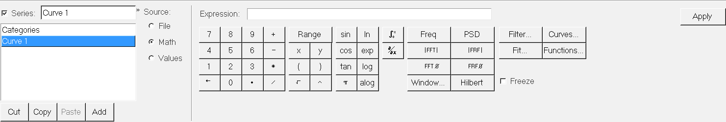
Figure 3. Source = Math
Values as a Data Source
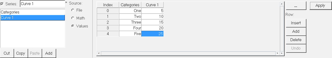
Figure 4. Source = Values
- Categories
- The bar chart display is divided into categories. Categories can be renamed by selecting a cell, typing a new name, and clicking Apply. You can have more than one bar series in each category. To plot category values using a Templex function, use {p1w1.category}.
- Curve
- Data point values can be entered directly into the Curve column in the Values table. Enter numbers in the Curve columns and click Apply. After adding a curve to the Curve list, a Curve column is displayed next to the Categories column. By default, a new curve is named Curve 1, Curve 2, and so on. If you change the name of the bar chart curve in the Curve list, the heading for the Curve column in the Values table also changes.
From the Row group box, you can insert, add, and delete rows in the Values table.
Click Undo to reverse the last task completed. Click the
expansion button, ![]() , to view a larger dialog containing all y data
points.
, to view a larger dialog containing all y data
points.