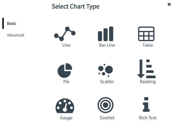
Envision allows you to create the following types of charts of the subcategory Basic - Line, Bar Line, Table, Pie, Scatter, Ranking, Gauge, Dashlet, and Rich Text. You can define or modify the titles and color schemes for the charts, and control the look and format of the legend, grid, and axes by using context-sensitive menus to create meaningful visualizations.
Once you understand what message you are trying to communicate with the data you have, it is time to select the best method for displaying that information. Different chart types cater best to different methods and are used to convey one of the following: relationships/comparisons, distribution, trends, or composition.
A comparison or relationship tries to show a correlation or pattern between two or more variables. Bar Line charts and Line charts, or combinations of the two, are very commonly used for the purpose of comparison. For example, a comparison of fatal car crashes by vehicle type.
A distribution tries to lay out a collection of related or unrelated information simple to see how it correlates, if at all, and to understand if there's any interaction between the variables, like the number of bugs reported during each month of a beta. Column and Line Histogram charts are probably the most common forms of distribution charts. Scatter plot charts are also great for this purpose.
Once you understand how your visualization should look, it will be easier to decide what kind of visualization you should use and how it will look and communicate its data.
The following questions will help you determine the most appropriate information that you want to convey with your data:
· What type of data is it? Nominal, ordinal, interval, or ratio data?
· How do the different parts of the data relate to each other?
· Can you pre-organize the data in a way that makes it easy for you to create your visualizations?
· What do you want to communicate with your data?
When you have understood the data, its organization, and how the parts of data relate to each other, you should consider using Envision visualization patterns to communicate your data. After creating a chart, you may want to adjust its appearance by modifying the chart properties.
Charts represent relationships among many values efficiently, and allow you to analyze data at a glance. The selection of chart type solely depends on the purpose of the visualization. For instance, tables are useful when you need to view precise values, and when you want to compare individual values to each other.
Envision allows you to create various types of charts and tables to represent data in an understandable format. The following table displays the recommended chart type to use based on the visualization purpose.
| Purpose | Recommended Chart Type |
| Displays trends over time | Line chart |
| Allows comparison of data side by side | Bar Line chart |
| Displays numbers and values | Table chart |
| Displays ratio to total | Pie chart |
| Displays correlation of measures | Scatter chart |
| Displays or ranks individual items with respect to one or several parameters | Ranking chart |
| Displays performance within an area, and usually display a single key measure | Gauge chart |
Displays trends between two successive measure values by comparison methods |
Dashlet chart |
Allows insertion of text within a dashboard with rich formatting options |
Rich Text chart |
Basic chart types |
||||||||
|
|
|
|
|
|
|
|
|
Line |
Bar Line |
Table |
Pie |
Scatter |
Ranking |
Gauge |
Dashlet |
Rich Text |