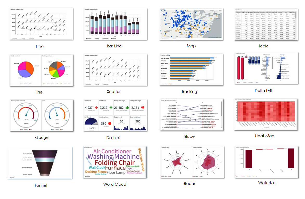
Envision enables you to dynamically create and design interactive visualizations of data in one or more report pages. Based on the decision-making model, Envision allows you to create charts from an array of Basic and Advanced chart types.
These charts not only facilitate decision making, but also allow interactivity with drill down and drill through options to gain a better understanding of a chart's underlying data.
Data visualization is a generic term that describes any effort to help understand the significance of data by placing it in a visual context. Patterns, trends, and correlations that can otherwise go undetected in text-based data can be exposed and recognized easier with data visualization.
Your chart or visualization should, therefore, serve the sole purpose of providing detailed insight into the meaning behind the data.
In order to design a data visualization, you would need to first understand the data itself, and then use well-known design patterns and use the type of visualization that conveys the best meaning possible.
While you design and build visualizations, consider the following rules of thumb:
· Ensure clarity and consistency to help the user navigate and understand the meaning of data.
· Maintain focus on a few metrics or Key Performance Indicators (KPIs) to be able to present them in order of priority.
· Ensure that the user can drill-down into the data. For example, create appropriate hierarchical dimensions for date and time to make it easy to drill down into year, month, and week.
· For indicators, use colors that are not color-vision deficient and difficult to distinguish.
|
|
|
|
Basic Chart types |
Advanced Chart types |
Editing |
Chart Utilities |