Heat Map charts represents data in a tabular format with user-defined color ranges like low, average, and high. It is used to plot complex data like performance comparison of different companies, periodic table, employee attendance, or stock market investments.
Heat Map charts are particularly useful when you want to visualize trends and movements over time, where the dimension values are evenly spaced, such as months, quarters, or fiscal years, for example. The condensed color-coded format of the Heat Map chart makes the data easier to comprehend.
In addition, using the Heat map Legend properties, you can selectively hide or display a given range by specifying the number of buckets that allow 'switching off' all other ranges from the legend.
Creating heat map charts
1. On the toolbar, select + New Page from the Pages drop down, or on the Filters and Settings pane, select the Pages tabbed page and then click the + icon to create a new page.
2. Click
the ![]() icon in the chart area
and then select the Advanced tabbed page.
icon in the chart area
and then select the Advanced tabbed page.
3. Select
the Heat Map chart type or click the icon at the top right corner of
the chart area and then select Heat Map
to create a Heat Map chart.
icon at the top right corner of
the chart area and then select Heat Map
to create a Heat Map chart.
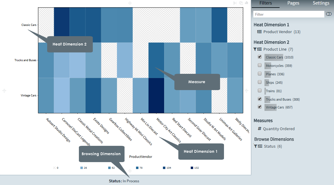
4. From the Dimensions pane, specify a Heat Dimension 1 for the Heat Map chart.
5. Specify a Heat Dimension 2 for your chart.
6. Specify a Measure for your chart.
Optionally, specify a Legend Dimension for your chart.
7. In the Filters and Settings pane, select any of the following:
▪ Filters tabbed page to browse the chart dimensions using the Dimensions Browser.
▪ Pages to view all pages in the current report as thumbnails.
▪ Settings to define drill through, page, or report properties for the chart.
Defining heat map chart properties
Envision allows you to define chart properties such as the color scheme, data format, legend, title, X axis, Y axis, border settings, and drill through.
The following table explains how to define these properties.
| Title properties | ||
Dialog |
Property | Description |
|
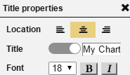
Location | Select a location (left, center, right) for the title. |
| Title | Click the indicator to display or hide the chart title. Specify a new title for your chart. |
|
| Font | Select a font size and style (bold, italic) for the title. | |
Display properties |
||
|
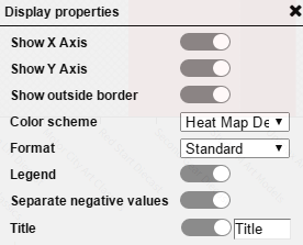
Show X Axis | Click the indicator to display or hide the X-Axis. |
| Show Y Axis | Click the indicator to display or hide the Y-Axis. | |
| Show outside border | Click the indicator to display or hide the outside border in the Heat Map. | |
| Color Scheme | Select a color scheme from the list of available color schemes. | |
| Format | Select a data format from the list of existing formats. | |
| Legend | Click the indicator to display or hide the legend. | |
| Separate negative values | Click the indicator to display or hide the negative values in the Heat Map. | |
| Title | Click the indicator to display
or hide the chart title. Specify a new title for your chart. |
|
Legend properties |
||
|
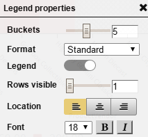
Buckets | Drag the Buckets indicator in the range 1-10 to display the specified number of buckets. |
| Format | Select a data format from the list of existing formats. | |
| Legend | Click the indicator to display or hide the legend. | |
| Rows visible | Drag the indicator in the range 1-10 to display the number of visible legend rows. | |
| Location | Specify a location for the legend display (left, center, right). | |
| Font | Select a font size and style (bold, italic) for the legend. | |
X Axis properties |
||
|
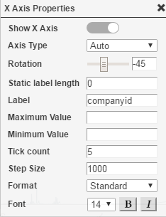
Show X Axis | Click the indicator to display or hide the X-Axis. |
| Rotation | Drag the indicator for rotating the labels for the X-Axis by 360 degrees, and for moving the X-Axis labels vertically and horizontally respectively. | |
| Static label length | Specify the static length for the X-Axis labels (number of alphabets to be displayed). | |
| Label | Enter the text for the X-Axis label. By default, the X-Axis dimension name is set as the default label text. | |
| Font | Select a font size and style (bold, italic) for the X Axis labels. | |
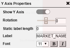
Y Axis properties |
||
|
Show Y Axis | Click the indicator to display or hide the Y-Axis. |
| Rotation | Drag the indicator for rotating the labels for the Y-Axis by 360 degrees, and for moving the Y-Axis labels vertically and horizontally respectively. | |
| Static label length | Specify the static length for the Y-Axis labels (number of alphabets to be displayed). | |
| Label | Enter the text for the Y-Axis label. By default, the Y-Axis dimension name is set as the default label text. | |
| Font | Select a font size and style (bold, italic) for the Y Axis labels. | |
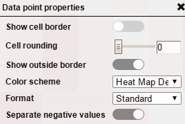
Data point properties |
||
|
Show cell border | Click the indicator to display or hide the cell borders. |
| Cell rounding | Drag the Rounding indicator in the range 0-20 to display a rounded edge for each cell. | |
| Show outside border | Click the indicator to display or hide the outside border for the Heat Map. | |
| Color scheme | Select a color scheme from the list of available color schemes. | |
| Format | Click the indicator to display or hide the negative values in the Heat Map. | |
| Separate negative values | Click the indicator to display or hide the negative values in the Heat Map. | |
|
|
Page Properties |
Report Properties |