


|
Color Variable Configuration for Text Columns Using the Palette Color Source
The configuration pane for the Color variable changes depending on the column data type.
When a text column is added to the Color variable, the configuration pane displays the color associated with each categorical item, as specified with a default color palette (e.g., Twenty Eight Colors).
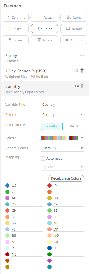
Note that since there are only 23 categorical items assigned to the colors of the selected palette, the remaining color palettes are left blank.
To use the #RGB Color Source, see Color Variable Configuration for Text Columns Using the RGB Color Source.
Steps:
1. On the Visualization Settings pane, click the Color variable. To associate other columns from the data table, drag and drop them to the Color variable drop area. Select one to display the corresponding configuration pane.
2. Enter the label of the Color variable in the Variable Title field.
You can parameterize the variable title to support dynamic schema in the dashboards.
3. You can also change the column to the be used as the Color variable from the Column drop-down list.
4. Select the Palette  Color
Source.
Color
Source.
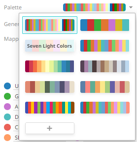
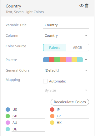
5. Click the Palette drop-down list to display and select from the available ones. By default, Twenty Eight Colors is selected.
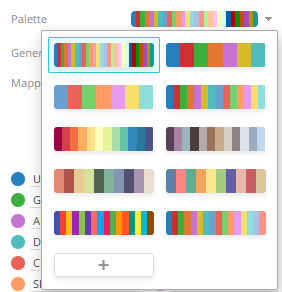
The number of categorical items for a visualization will depend on the selected palette. For example, if you select Seven Standard Colors, the list of categorical items will be reduced to seven.
9. Click 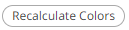 to re-retrieve the categorical
items and match them to the color palette.
to re-retrieve the categorical
items and match them to the color palette.
10. Select the General Colors that will be used for the Color variable.
11. Checking the Automatic Mapping box enables the Modes drop-down list:
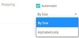
12. You can either assign the categorical color assignment when new data is dynamically loaded into the visualization:
· By Size
The color assignment is based on the Size variable.
· Alphabetically
The color assignment is done alphabetically.
|
NOTE |
· This would occur as a result of navigation action defining a parameterized data set to be displayed in the visualization. · The following visualizations will now use the selected Height variable: o Bar Graph (Horizontal and Vertical) o Bullet Graph (Horizontal and Vertical) o Dot Plot (Horizontal and Vertical) o Line Graph o Numeric Line Graph o Needle Graph o Order Book Graph o Pareto Chart · The following visualizations are using the selected Size variable: o Circle Pack o Map Plot o Network Graph o Pie Chart o Scatter Plot o Stack Graph o Timeseries Scatter Plot o Treemap The rest of the visualizations will perform as before.
|
13. Click the Save  icon on the toolbar.
When
saved, the  notification is displayed.