Review Evaluation Results
Review the input variable and output response values for each run, as well as review the run files.
View Run Data Summary
View a detailed summary of all input variable and output response run data in a tabular format from the Evaluation Data tab.
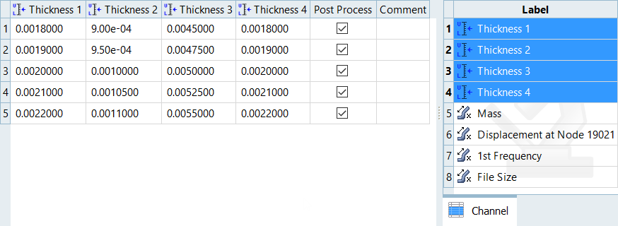
Figure 1.
Analyze Evaluation Plot
Plot a 2D chart of the input variable and output response values for each run using the Evaluation Plot tool.
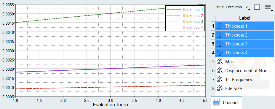
Figure 2.
Analyze Dependency Between Two Sets of Data
Analyze the dependency between two sets of data in a scatter plot from the Evaluation Scatter tab. Visually emphasize data in the scatter plot by appending additional dimensions in the form of bubbles.
- From the Evaluate Step, click the Evaluation Scatter tab.
-
Select data to display in the scatter plot.
- Use the Channel selector to select two dimensions of data to plot.
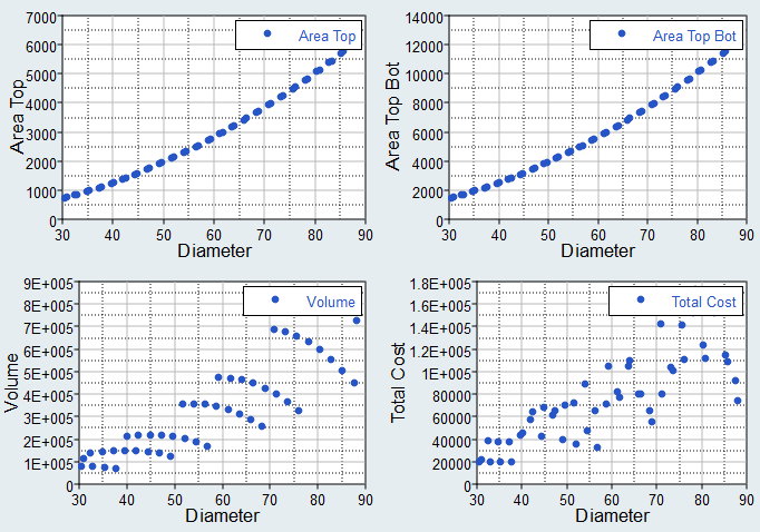
Figure 3. - Use the Bubbles selector to select additional dimensions of data to
visually emphasize in the scatter plot. The selected input variables/output
responses are represented by varying sizes and colors of bubbles.The size and color of bubbles is determined by values in the run data for the selected input variable/output response. For size, larger bubbles equal larger values. For color, different shades of red, blue, and gray are used to visualize the range of values. The darker the shade of red, the larger the value. The lighter the shade of blue, the smaller the value. Gray represents the median value.
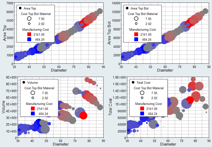
Figure 4.
- Use the Channel selector to select two dimensions of data to plot.
- Analyze the dependencies between the selected data sets.
View Iteration History Summary
View a detailed iteration history summary of all input variables and output responses in a tabular format using the Iteration History tool.
- From the Evaluate step, click the Iteration History tab.
- From the Channel selector, select the channels to display in the table.
- Analyze the iteration history summary.
Iteration History Table Data
Data reported in the Iteration History table.
General Column Data
- Iteration Index
- Displays the current iteration number.
- Evaluation Reference
- Corresponds to the row number in the Evaluation Data table.
- Iteration Reference
- Displays the iteration number where the current optimal is located.
- Condition
- Identifies one of three states for the iterate:
- Violated. At least one constraint is violated.
- Feasible. No constraints are violated.
- Acceptable. At least one constraints violated, but only by a very small percentage.
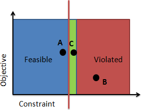
Figure 5. Violation Codes. A minimized objective versus an output response constrained to stay below a bound. Design A is feasible, design B is violated, and design C is acceptable. The plot exaggerates the size of the green zone for visualization, it is typically very small. - Best Iteration
- Identifies the set of iterations on the non-dominated Pareto front; this
is the optimal set of solutions in a multi-objective optimization. Note:
- Only applicable to multi-objective problems.
- This column is populated once the evaluation is complete
System Identification Column Data
- Objective Function Value
- Sum of normalized difference-squared between the objective function value and target value.
- DTV
- Delta between the target value and the objective value for each objective.
- DTVN
- Normalized DTV for each objective.
Probabilistic Method Column Data
When using a probabilistic method, additional columns are added to the Iteration History table. The probabilistic method channels are defined in Table 1.
| Channel | SORA and SORA_ARSM | SRO |
|---|---|---|
| Objective label | The value of the objective at the given input variable values. | The value of the objective at the given input variable values. |
| Objective label (value at percentile) | The estimated objective value at the specified robust min/max percent CDF. | - |
| Standard Deviation of Objective | - | The measurement of the spread in the objective distribution. |
| Constraint label | The value of the constraint at the given input variable values. | The value of the constraint at the given input variable values. |
| Constraint label (value at percentile) | The estimated constraint value at the constrained CDF limit. | The reliability of design with respect to this constraint. |
| System reliability | - | The reliability of the system considering all constraints. |
The value of the constraint that meets the required reliability.
Consider a case where a constraint value needs to be less than 75.0 with 98% reliability. In the first iteration, Sequential Optimization and Reliability Assessment finds a design with a constraint value of 75.025, but the PV value for 98% reliability is at 99.383. Hence, this design meets the constraint's upper bound, but does not meet the reliability requirement. In the sixth iteration, Sequential Optimization and Reliability Assessment finds a design with a constraint value of 57.412 and the PV value for 98% reliability is at 75.075. This design meets the reliability constraint, as 98% of the design will have a constraint value less than 75.075.
Column Color Coding
- White Background/Black Font
- Feasible design
- White Background/Red Font
- Violated design
- White Background/Orange Font
- Acceptable design, but at least one constraint is near violated
- Green Background/White Font
- Optimal design
- Green Background/Orange Font
- Optimal design, but at least one constraint is near violated
Analyze Iteration Plot
Plot the iteration history of a study's objectives, constraints, input variables and unused output responses in a 2D chart using the Iteration Plot tab.
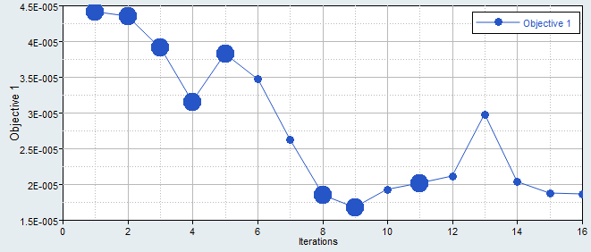
Figure 6. Objective History
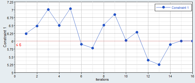
Figure 7. Constraint History