Review Evaluation Results
Review the input variable and output response values for each run, as well as review the run files.
View Cross-Validation R2 History Summary
View a detailed cross-validation R2 history summary of all output responses in a tabular format using the R2 History tool.
-
Analyze the iteration history summary.
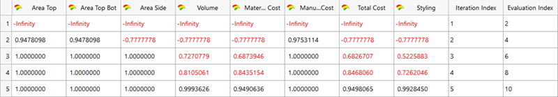
Figure 1.
Analyze R2 Plot
Plot the iteration history of cross-validation R2 value for each output response in a 2D chart using the R2 Plot tab.
View Run Data Summary
View a detailed summary of all input variable and output response run data in a tabular format from the Summary post processingEvaluation Data tab.
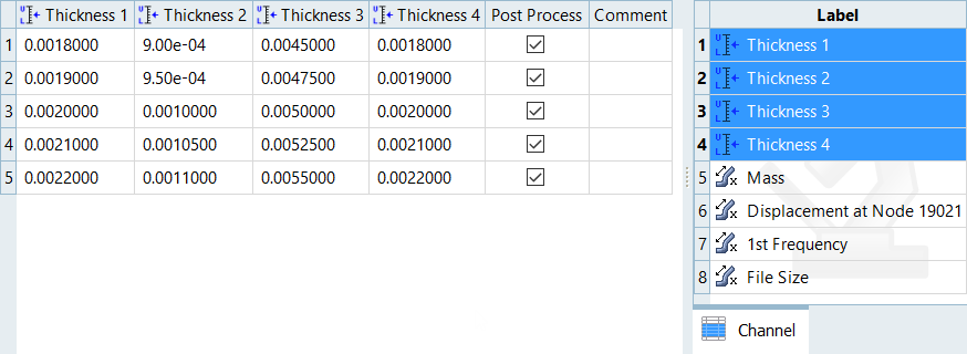
Figure 2.
Analyze Evaluation Plot
Plot a 2D chart of the input variable and output response values for each run using the Evaluation Plot tool.
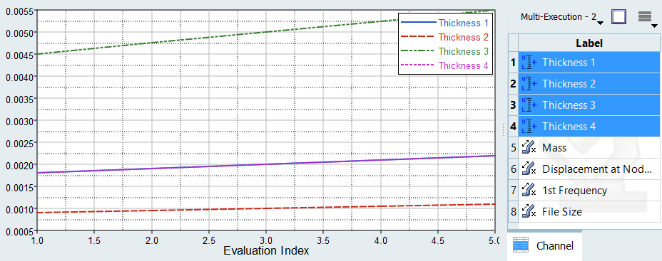
Figure 3.
Analyze Dependency Between Two Sets of Data
Analyze the dependency between two sets of data in a scatter plot from the Scatter post processingEvaluation Scatter tab. Visually emphasize data in the scatter plot by appending additional dimensions in the form of bubbles.
- From the Evaluate Step, click the Evaluation Scatter tab.
- From the Post Processing step, click the Scatter tab.
-
Select data to display in the scatter plot.
- Use the Channel selector to select two dimensions of data to plot.
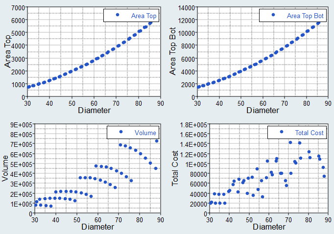
Figure 4. - Use the Correlation selector to select one or
more values from the correlation map to plot.
Correlation measures the strength and direction between associated variables. Correlation coefficients can have a value from -1 to 1; -1 indicates a strong but negative correlation and 1 indicates a strong and positive correlation.
Note: Data points are colored according to their corresponding cell in the correlation map when there are no selections active in the Bubbles selector.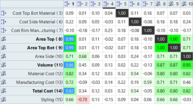
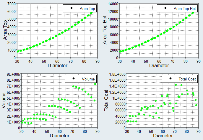
Figure 5. - Use the Bubbles selector to select additional dimensions of data to
visually emphasize in the scatter plot. The selected input variables/output
responses are represented by varying sizes and colors of bubbles.The size and color of bubbles is determined by values in the run data for the selected input variable/output response. For size, larger bubbles equal larger values. For color, different shades of red, blue, and gray are used to visualize the range of values. The darker the shade of red, the larger the value. The lighter the shade of blue, the smaller the value. Gray represents the median value.
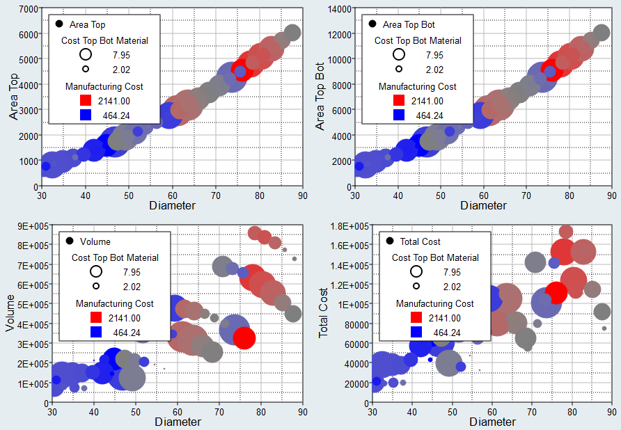
Figure 6.
- Use the Channel selector to select two dimensions of data to plot.
- Analyze the dependencies between the selected data sets.
Evaluation ScatterScatter Tab Settings
Settings to configure the plots displayed in the Evaluation ScatterScatter post processing tab.
In the Scatter post processing tab, there are three methods for selecting data to display in the scatter plot: Channel, Correlation, and Bubble.
In the Evaluation Scatter tab, there are two methods for selecting data to display in the scatter plot: Channel and Bubble.
Access settings from the menu that displays when you click ![]() (located in the top, right corner of the work
area).
(located in the top, right corner of the work
area).
Channel Settings
- X-Bounds
- Display the X bounds in the plot.
- Y-Bounds
- Display the Y bounds in the plot.
Correlation Settings
- Pearson Product-Moment / Spearman's Rank
-
- Pearson Product-Moment (default)
- Assumes a linear association, and the coefficient values indicate how far away all of the data points are from a line of best fit through the data.
- Spearman's Rank
- Assumes a monotonic association, and the coefficient values indicate the degree of similarity between rankings.
- Correlation ≥
- Show only the column/rows with cells over the specified threshold.
- Show Variables and Responses
- Restrict the view of the entire correlation matrix to input variables only, output responses only, input variables and output responses, or input variables versus output responses.
- Include Gradients
- X-Bounds
- Display the X bounds in the plot.
- Y-Bounds
- Display the Y bounds in the plot.
Bubble Settings
- Size
- Scale
- Adjust the overall size of all bubbles.
- Focus
- Adjust the size of bubbles so that smaller bubbles become smaller, while larger bubbles remain fixed, enabling the view to be directed at larger bubbles.
- Invert
- Reverse the size of bubbles so that smaller values are represented by larger bubbles.
- Color
- Discrete Steps
- Change the level of color shading applied to bubbles.
- Bins
- Specify the number of red, blue, and gray shades used to color bubbles.
- Invert
- Reverse the color of bubbles so that red represents smaller values and blue represents larger values.