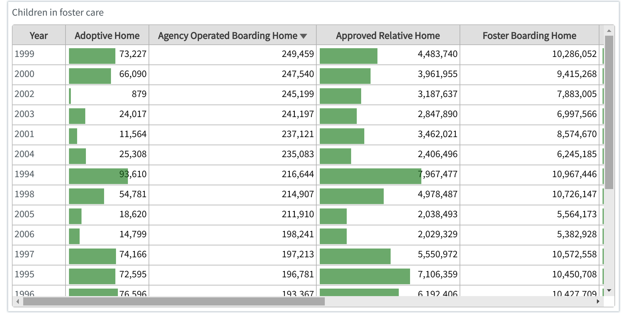
A Table chart displays several fields simultaneously, where the content of each row is logically connected. Typically, a table consists of one dimension and several measures. A Table chart is the simplest form of data representation, where, the data within each column is consistent. A column must contain data formatted in the same way, and if you combine data formats within a column, the table will not render properly.
The table displays values in record format so that each row of the table contains fields calculated using measures.
You can create a Table chart using any of the following:
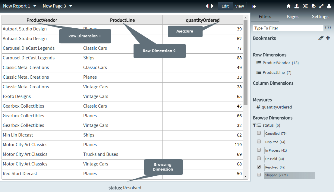
· (one/many) row dimensions
· (one/many) row dimensions and (one/many) measures
· (one/many) row dimensions with one column dimension, and (one/many) measures
Table chart variants
|
|
|
|
Table-Inline Bars |
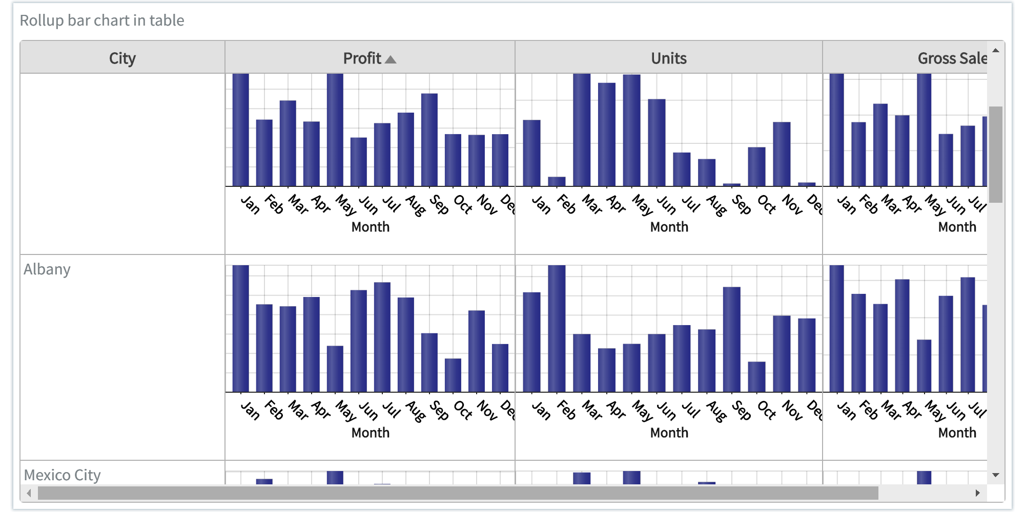
Table-Rollup Bars |
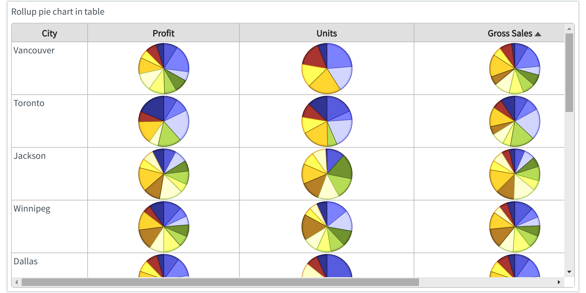
Table-Rollup Pies |
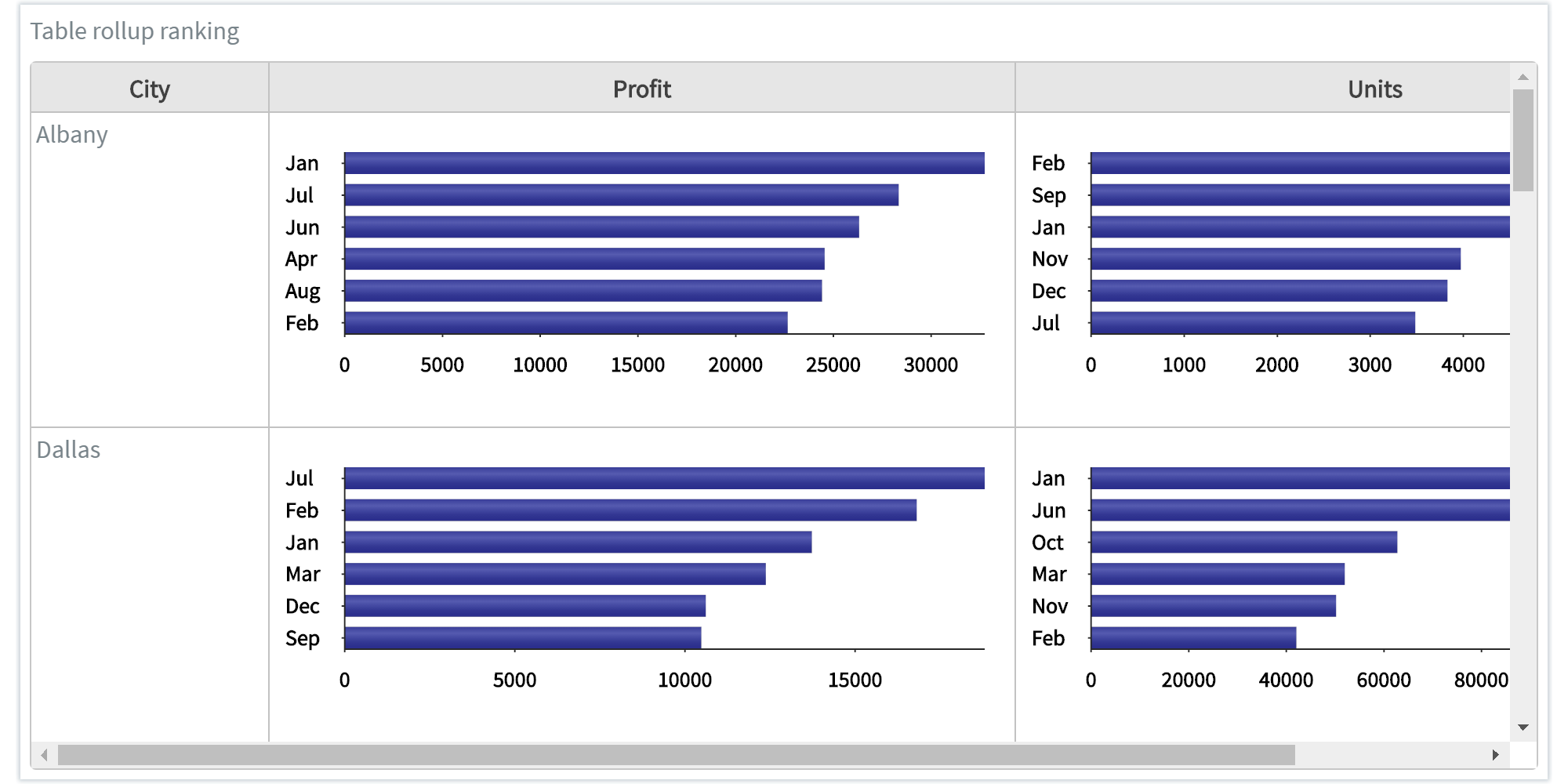
Table-Rollup Ranking |
Table charts are particularly useful for viewing precise values rather than the visualizations of those values, and when you want to compare individual values. A table also allows you to represent drill-down groups when used as a dimension.
You can include many values in a table, and when you drill down in a table, you reuse limited space in the page. A table is a good choice when you want to see exact values rather than trends or patterns. However, if the table contains many values, it is difficult to get an overview of the relationship between values and of trends. It is also difficult to identify irregularity within the table.
Creating table charts
1. On the toolbar, select + New Page from the Pages drop down, or on the Filters and Settings pane, select the Pages tabbed page and then click the + icon to create a new page.
2. Click
the ![]() icon in the chart area
and then select the Basic tabbed page.
icon in the chart area
and then select the Basic tabbed page.
3. Select
the Table chart type or click the icon at the top right corner of the chart area and then
select Table to create a Table chart.
icon at the top right corner of the chart area and then
select Table to create a Table chart.
4. From the Dimensions pane, specify the Row Dimensions for the Table chart.
5. Specify the Column Dimensions for your chart.
6. Specify a Measure for your chart.
7. In the Filters and Settings pane, select any of the following:
▪ Filters tabbed page to browse the chart dimensions using the Dimensions Browser.
▪ Pages to view all pages in the current report as thumbnails.
▪ Settings to define drill through, page, or report properties for the chart.
Defining table chart properties
Envision allows you to define chart properties such as the color scheme, title, data format, total display, roll up settings, and drill through.
The following table explains how to define these properties.
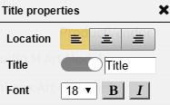
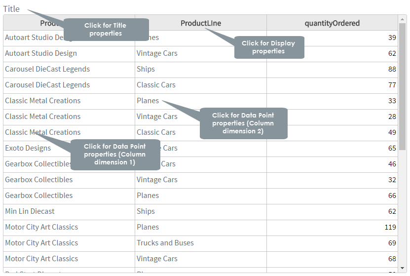
| Title properties | ||
Dialog |
Property | Description |
|
Location | Select a location (left, center, right) for the title. |
| Title | Click the indicator to display or hide the chart title. Specify a new title for your chart. |
|
| Font | Select a font size and style (bold, italic) for the title. | |
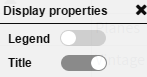
Display properties |
||
|
Legend | Click the indicator to display or hide the legend. |
| Title | Click the indicator to display
or hide the chart title. Specify a new title for your chart. |
|
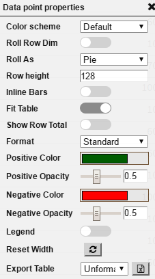
Data point properties (Measure) |
||
|
Color scheme | Select a color scheme from the list of available color schemes. |
| Roll row Dim | Click the indicator to represent the lowest or granular level row elements in the form of a new chart. Roll row dimension also works if there is only one row dimension with totals applied to the table. | |
| Roll As | Select Pie, Bar Line, or Ranking from the Roll As list. The selected chart type is displayed for the lowest or granular level row elements. | |
| Row height | Specify the row height for the lowest or granular row elements. | |
| Inline bars | Click the indicator to display the selected Measures as inline bars. For more information on how to represent the Measure as inline bars, see Configuring Inline Bars Settings. | |
| Fit Table | Click the indicator to expand the entire table to cover the chart area or to adjust the width based on the data. | |
| Show Row Total | Click the Show Row Total indicator to display totals for the tabular values. | |
| Format | Select a data format that you want to apply to the Measure column from the list. For applying a different data format for each column, see Working with Data Formats. | |
| Positive Color | Select a color for the positive values from the color palette, and then click choose. | |
| Positive Opacity | Drag the indicator in the range 0-1 to set the opacity level for the positive values. | |
| Negative Color | Select a color for the negative values from the color palette, and then click choose. | |
| Negative Opacity | Drag the indicator in the range 0-1 to set the opacity level for the negative values. | |
| Reset Width | Click to revert the width of the resized columns to the default width. | |
| Export Table | Select a format from the list for exporting the Table chart into XLS format. | |
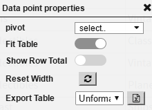
Data point properties (Column dimension) |
||
|
pivot | Select a pivot dimension from the list for displaying as an additional column. For more information on how to use a pivot dimension, see Configuring Pivot Dimension Settings. Applicable for table charts with multiple row dimensions only. |
| Fit Table | Click the indicator to expand the entire table to cover the chart area or to adjust the width based on the data. | |
| Show Row Total | Click the Show Row Total indicator to display totals for the tabular values. | |
| Reset Width | Click to revert the width of the resized columns to the default width. | |
| Export Table | Select a format from the list for exporting the Table chart. For more information on how to export tables, see Exporting Tables. | |
| For | Specify |
| Roll Up Settings | Rollup also works if pivot dimensions are applied. |
| Expand To | Select a dimension to invert the selected dimensions at different levels or collapse all the dimensions. |
You can export a Table chart that you have created into XLS format to do the following:
· Re-import the exported XLS as a new data source
· Share the imported XLS with other users
· Use Excel functionality on the imported Table chart
Exporting tables
· In
the Data point properties dialog box, select
a format from the list and then click the![]() icon.
icon.
The selected Table chart is exported into XLS format.
If you have resized the columns of the Table chart, you can revert the width of these columns to the default width.
Resetting the column width
· In
the Data point properties dialog box, click
the![]() icon to reset the width of
the columns of the Table chart.
icon to reset the width of
the columns of the Table chart.
The column is reset to its default width.
You can assign a different format for each column (Measure) of the Table chart.
Assigning data formats for a column
· In the Data point properties dialog box, select a data format that you want to apply to the Measure column from the list.
The column is displayed in the selected data format. For more information on creating new data formats, see Creating Data Formats.
The Inline bars settings allow you to represent the selected Measures as inline bars in a Table chart.
Configuring inline bars settings
· In the Data point properties dialog box, click the Inline bars indicator to display the selected Measure as inline bars.
The Measure that you select is displayed as inline bars based on the highest column values with the highest value represented by the longest inline bar.
The Group menu settings allows you to collapse all the dimensions or invert the selected dimensions at different levels.
For example, if you add a 3rd dimension called Product_Name in the Table chart, the chart will display the Product_Name elements grouped under PRODUCTFAMILY_Name and the PRODUCTFAMILY_Name elements are grouped under the MKT_CODE dimension.
Essentially, the dimensional elements are grouped under the selected dimension based on hierarchy.
Configuring group menu settings
· In the Data point properties dialog box, select Expand to and then select a dimension from the list to invert the selected dimensions at different levels or collapse all the dimensions. You can:
▪ All the 2nd dimensional elements under the 1st dimensional element.
▪ Invert the selection to remove the selected Group menu settings.
Pivoting a dimension pivots the data to change its orientation in the Table chart. You can move dimensions between columns and in and out of the chart. When you select a pivot dimension, Envision moves the selected dimension to another column in the table. drag and drop row dims they will all be columns
The Table chart must have more than one row dimension to be able to select a pivot dimension.
Using the pivot dimension settings
· In the Data point properties dialog box, select the dimension that you want to use as pivot from the list and then select the check box next to the dimension.
The Table chart displays the selected pivot dimension as an additional column.
· Deselect the pivot dimension check box to make the dimension hierarchical.
|
|
Page Properties |
Report Properties |