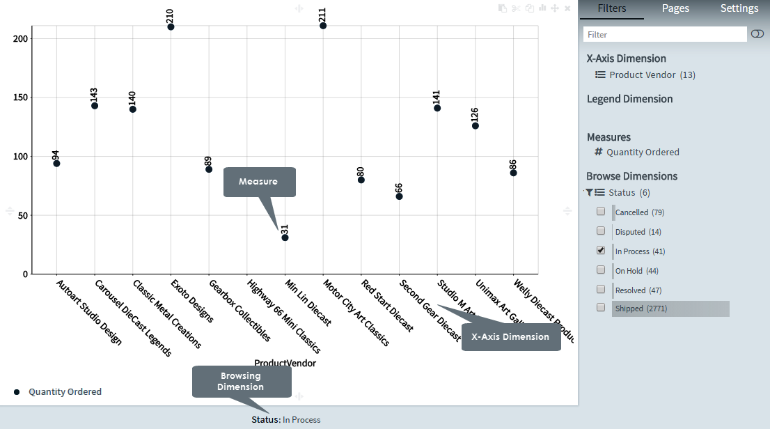
A Scatter chart shows the relationship for two variables for a set of data. The data is displayed as a scattered collection of points, each having the value of one variable determining the position on the horizontal axis, and the value of the other variable determining the position on the vertical axis.
Scatter charts are used to plot data points on a horizontal and a vertical axis to show how much one variable is affected by another. Each row in the data table is represented by a marker whose position depends on its values in the columns set on the X and Y axes.
Scatter charts are particularly useful for identifying potential relationships between values, and visualizing irregularity from a group, or, when you want to display data where each instance has two metrics. The Scatter chart is the only chart type that can show the correlation of two or more measures at the same time to which you can also add a Legend dimension. The third measure is an efficient way of differentiating between values and simplifying the identification.
For example, if you want to visualize data where each instance has two numbers, the relationship between Sales and Quantity per Customer, a Scatter chart would show the pairs of values from two or three measures.
Creating scatter charts
1. On the toolbar, select + New Page from the Pages drop down, or on the Filters and Settings pane, select the Pages tabbed page and then click the + icon to create a new page.
2. Click
the ![]() icon in the chart area
and then select the Basic tabbed page.
icon in the chart area
and then select the Basic tabbed page.
3. Select
the Scatter chart type or click the icon at the top right corner of
the chart area and then select Scatter
to create a Scatter chart.
icon at the top right corner of
the chart area and then select Scatter
to create a Scatter chart.
4. From the Dimensions pane, specify an X Axis Dimension for the Scatter chart.
5. Specify a Measure for your chart.
Optionally, specify a Legend Dimension for your chart.
6. In the Filters and Settings pane, select any of the following:
▪ Filters tabbed page to browse the chart dimensions using the Dimensions Browser.
▪ Pages to view all pages in the current report as thumbnails.
▪ Settings to define drill through, page, or report properties for the chart.
Defining scatter chart properties
The Envision chart area comprises context-sensitive menus that allow you to click various areas of the chart to define the chart properties such as the data point properties, display, title, label, legend, X and Y axis settings, and so on.
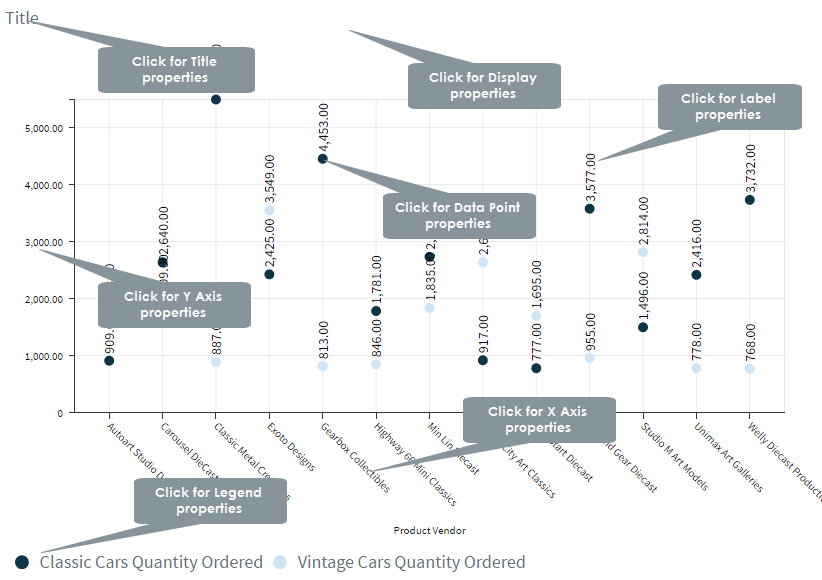
The following table explains how to define these properties.
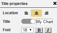
Title properties |
||
| Dialog | Property | Description |
|
Location | Select a location (left, center, right) for the title. |
| Title | Click the indicator to display or hide the chart title. Specify a new title for your chart. |
|
| Font | Select a font size and style (bold, italic) for the title. | |
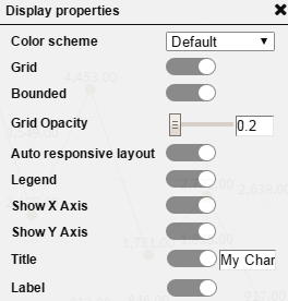
Display properties |
||
|
Color Scheme | Select a color scheme from the list of available color schemes. |
| Grid | Click the indicator to display or hide the grid. | |
| Bounded | Click the indicator to display or hide the border (bound). | |
| Grid Opacity | Drag the indicator in the range 0-1 to set the opacity level for the grid. | |
| Auto responsive layout | Click the indicator to enable auto responsive layout for various devices. | |
| Show X Axis | Click the indicator to display or hide the X-Axis. | |
| Show Y Axis | Click the indicator to display or hide the Y-Axis. | |
| Title | Click the indicator to display or hide the chart title. Specify a new title for your chart. |
|
| Label | Click the indicator to display or hide labels for the chart values. | |
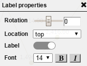
Label properties |
||
|
Rotation | Drag the indicator for rotating the labels for the 'Y' and 'X' positions by 360 degrees, and for moving the labels for the X-Axis and Y-Axis positions vertically and horizontally respectively. |
| Location | Select a location for the labels (top, bottom) from the list. | |
| Label | Click the indicator to display or hide labels for the chart values. | |
| Font | Select a font size and style (bold, italic) for the labels. | |
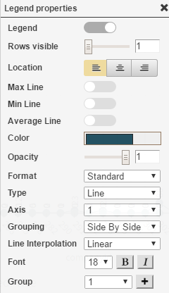
Legend properties |
||
|
Legend | Click the indicator to display or hide the legend. |
| Rows visible | Drag the indicator in the range 1-10 to display the number of visible legend rows. | |
| Location | Specify a location for the legend display (left, center, right). | |
| Max Line | Click the indicator to display or hide the maximum value indicator line. | |
| Min Line | Click the indicator to display or hide the minimum value indicator line. | |
| Average Line | Click the indicator to display or hide the average value indicator line. | |
| Color | Select a color for the legend and the line connecting the data points from the color palette, and then click choose. | |
| Opacity | Drag the indicator in the range 0-1 to set the opacity level for the legend. | |
| Format | Select a data format from the list of existing formats. | |
| Type | Select Bar, Line, Area, or Point type from the list. | |
| Axis | Select 1 or 2 to display one or two axes. | |
| Grouping | Select Side-By-Side or Stacked from the list. | |
| Line Interpolation | Select the type of interpolation (Linear, Cardinal, Monotone, Step Before, Step After) for the line connecting the data points from the list. | |
| Font | Select the font size for the legend, and style (bold, italic) from the respective lists. | |
| Group | Select the number of groups from the list or add a new group. | |
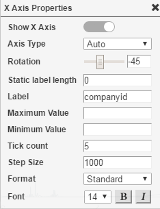
X Axis properties |
||
|
Show X Axis | Click the indicator to display or hide the X-Axis. |
| Axis Type | Select the type of axis based on the dimension type from the
list (Auto, Linear,
Log, ordinal).
By default, the axis type is Auto. Linear and Log are applicable
to dimensions of numeric data type only. For Log type, specify a value for Log to Base. |
|
| Rotation | Drag the indicator for rotating the labels for the X-Axis by 360 degrees, and for moving the X-Axis labels vertically and horizontally respectively. | |
| Static label length | Specify the static length for the X-Axis labels (number of alphabets to be displayed). | |
| Label | Enter the text for the X-Axis label. By default, the X-Axis dimension name is set as the default label text. | |
| Maximum Value | Specify the maximum value to be displayed on the X-Axis. Applicable to Line, Point, and Area variants only. | |
| Minimum Value | Specify the minimum value to be displayed on the X-Axis. Applicable to Line, Point, and Area variants only. | |
| Tick count | Specify the number of ticks to be displayed on the X-Axis. Applicable to Line, Point, and Area variants only. | |
| Step Size | Specify the size of the step to be displayed on the X-Axis. Applicable to Line, Point, and Area variants only. | |
| Format | Select a data format for displaying the X-Axis values. | |
| Font | Select a font size and style (bold, italic) for the X-Axis labels. | |
Y Axis properties |
||
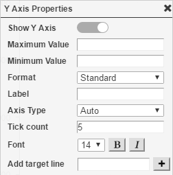 |
Show Y Axis | Click the indicator to display or hide the Y-Axis. |
| Maximum Value | Specify the maximum value to be displayed on the X-Axis. Applicable to Line, Point, and Area variants only. | |
| Minimum Value | Specify the minimum value to be displayed on the Y-Axis. Applicable to Line, Point, and Area variants only. | |
| Format | Select a data format for displaying the Y-Axis values. | |
| Label | Enter the text for the Y-Axis label. | |
| Axis Type | Specify the maximum value to be displayed on the Y-Axis. Applicable to Line, Point, and Area variants only. | |
| Tick count | Specify the number of ticks to be displayed on the Y-Axis. Applicable to Line, Point, and Area variants only. | |
| Font | Select a font size and style (bold, italic) for the Y-Axis labels. | |
| Add target line | Specify a target value that the threshold line will indicate and then click +. | |
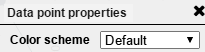
Data point properties |
||
|
Color scheme | Select a color scheme from the list of available color schemes. |
|
|
Page Properties |
Report Properties |