Pie charts represent the value of the individual items with respect to the total items and is built from a single dimension and measure only.
The Pie chart displays the relationship between values as well as the relation of a single value to the total. You can use a Pie chart when you have a single data series with only positive values. Envision allows you to add a secondary analysis dimension on the same pie using the slice height method.
Pie chart variants
|
|
Pie-3D |
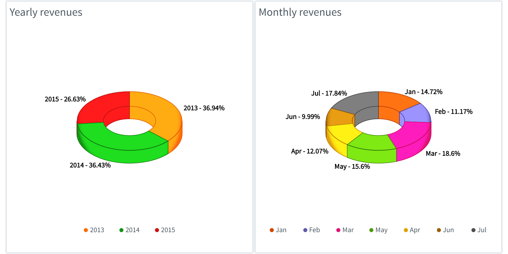
Pie-Donut |
Pie charts are particularly useful for comparing a certain sector with the total. It provides an instant understanding of proportions when few sectors are used as dimensions, for example, 'queued/finished', or 'in-time/delayed/cancelled' to retain its visual efficiency.
However, it is often hard to compare the results of two Pie charts, or different sectors of a Pie chart, especially in a chart with many sectors. Also, the Pie chart takes up more of chart space in comparison to the values it visualizes.
Creating pie charts
1. On the toolbar, select + New Page from the Pages drop down, or on the Filters and Settings pane, select the Pages tabbed page and then click the + icon to create a new page.
2. Click
the ![]() icon in the chart area
and then select the Basic tabbed page.
icon in the chart area
and then select the Basic tabbed page.
3. Select
the Pie chart type or click the icon at the top right corner of the chart area and then
select Pie to create a Pie chart.
icon at the top right corner of the chart area and then
select Pie to create a Pie chart.
4. From the Dimensions pane, specify a Pie Dimension for the Pie chart.
5. Specify a Measure for your chart.
Optionally, specify a Legend Dimension for your chart.
6. In the Filters and Settings pane, select any of the following:
▪ Filters tabbed page to browse the chart dimensions using the Dimensions Browser.
▪ Pages to view all pages in the current report as thumbnails.
▪ Settings to define drill through, page, or report properties for the chart.
Defining pie chart properties
The Envision chart area comprises context-sensitive menus that allow you to click various areas of the chart to define the chart properties such as the data point properties, display, title, label, legend, and so on.
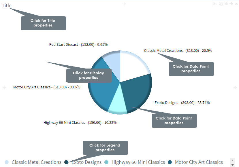
The following table explains how to define these properties.
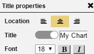
| Title properties | ||
| Property | For | Specify |
|
Location | Select a location (left, center, right) for the title. |
| Title | Click the indicator to display or hide the chart title. Specify a new title for your chart. |
|
| Font | Select a font size and style (bold, italic) for the title. | |
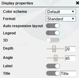
Display properties |
||
|
Color Scheme | Select a color scheme from the list of available color schemes. |
| Format | Select a format from the list of available data formats. | |
| Auto responsive layout | Click the indicator to enable auto responsive layout for various devices. | |
| Legend | Click the indicator to display or hide the legend. | |
3D |
Click the indicator to activate the chart in 3D format. | |
| Depth | Drag the Depth indicator in the range 0-50 to increase and decrease the depth of the Pie chart. | |
| Angle | Drag the indicator in the range 0-90 to specify the viewing angle of the Pie chart. | |
| Label | Click the indicator to display or hide labels for the chart values. | |
| Title | Click the indicator to display
or hide the chart title. Specify a new title for your chart. |
|
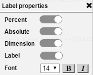
Label properties |
||
|
Percent | Drag the indicator for rotating the labels for the 'Y' and 'X' positions by 360 degrees, and for moving the labels for the X-Axis and Y-Axis positions vertically and horizontally respectively. |
| Absolute | Select a location for the labels (top, bottom) from the list. | |
| Dimension | Click the indicator to display or hide the labels. | |
| Label | Click the indicator to display or hide labels for the chart values. | |
| Font | Select a font size and style (bold, italic) for the labels. | |
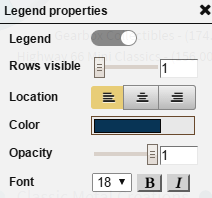
Legend properties |
||
|
Legend | Click the indicator to display or hide the legend. |
| Rows visible | Drag the indicator in the range 1-10 to display the number of visible legend rows. | |
| Location | Specify a location for the legend display (left, center, right). | |
| Color | Select a color for the legend and the line connecting the data points from the color palette, and then click choose. | |
| Opacity | Drag the indicator in the range 0-1 to set the opacity level for the legend. | |
| Font | Select a font size and style (bold, italic) for the legend. | |
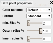
Data point properties |
||
|
Color Scheme | Select a color scheme from the list of available color schemes. |
| Format | Select a data format from the list that contains the default data format as well as the data formats that you have created. | |
| min. Slice % | Drag the Minimum Slice indicator in the range 0-50 to increase or decrease the number of pie slices. If you drag the indicator to the maximum value, the chart does not display the less-significant data. This data will then be displayed in the 'Others' slice. | |
| Outer radius % | Drag the indicator in the range 1-100 to specify the outer radius of the pie in %. | |
| Inner radius % | Drag the indicator in the range 0-99 to specify the inner radius of the pie in %. As you increase the inner radius it becomes a Donut chart. | |
|
|
Page Properties |
Report Properties |