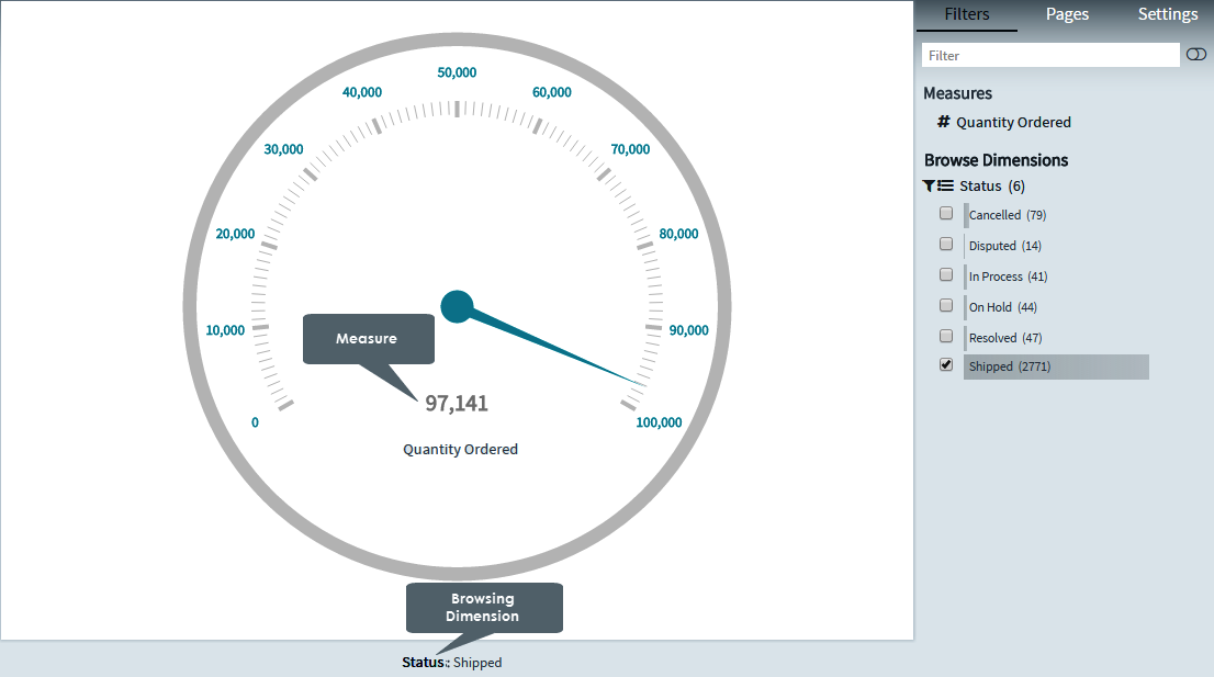
Gauge charts allow you to visualize data in a way that resembles a real-life speedometer needle or a regular gauge. They provide an instant indication of the performance within an area, and usually display a single key measure. They work best for single data points.
The Gauge chart is designed to show only one measure value. In addition to the current value, you can also define the minimum and maximum values, and color segments of your choice.
You use the Gauge chart when you want to visualize a single key measure value. You can use color coding to support the interpretation of the value. However, the Gauge chart is quite space-intensive in relation to the single value it visualizes, and interactivity using selections is limited.
Creating gauge charts
1. On the toolbar, select + New Page from the Pages drop down, or on the Filters and Settings pane, select the Pages tabbed page and then click the + icon to create a new page.
2. Click
the ![]() icon in the chart area
and then select the Basic tabbed page.
icon in the chart area
and then select the Basic tabbed page.
3. Select
the Gauge chart type or click the icon at the top right corner of the chart area and then
select Gauge to create a Gauge chart.
icon at the top right corner of the chart area and then
select Gauge to create a Gauge chart.
4. From the Dimensions pane, specify a Measure for your chart.
Optionally, specify a Legend Dimension for your chart.
5. In the Filters and Settings pane, select any of the following:
▪ Filters tabbed page to browse the chart dimensions using the Dimensions Browser.
▪ Pages to view all pages in the current report as thumbnails.
▪ Settings to define drill through, page, or report properties for the chart.
Defining gauge chart properties
The Envision chart area comprises context-sensitive menus that allow you to click various areas of the chart to define the chart properties such as the such as the data point properties, display, title, and so on.
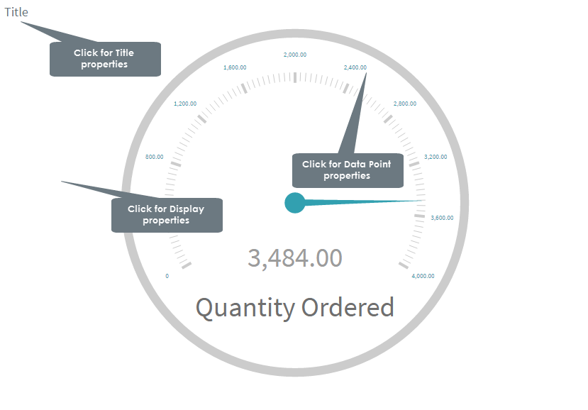
The following table explains how to define these properties.
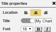
| Title properties | ||
| Dialog | Property | Description |
|
Location | Select a location (left, center, right) for the title. |
| Title | Click the indicator to display or hide the chart title. Specify a new title for your chart. |
|
| Font | Select a font size and style (bold, italic) for the title. | |
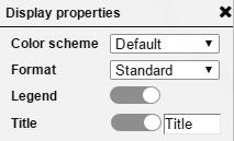
Display properties |
||
|
Color Scheme | Select a color scheme from the list of available color schemes. |
| Format | Select a format from the list of available data formats. | |
| Legend | Click the indicator to display or hide the legend. | |
| Title | Click the indicator to display
or hide the chart title. Specify a new title for your chart. |
|
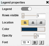
Legend properties |
||
|
Legend | Click the indicator to display or hide the legend. |
| Rows visible | Drag the indicator in the range 1-10 to display the number of visible legend rows. | |
| Location | Specify a location for the legend display (left, center, right). | |
| Color | Select a color for the legend and the line connecting the data points from the color palette, and then click choose. | |
| Opacity | Drag the indicator in the range 0-1 to set the opacity level for the legend. | |
| Font | Select a font size and style (bold, italic) for the legend. | |
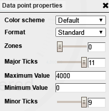
Data point properties |
||
|
Color Scheme | Select a color scheme from the list of available color schemes. |
| Format | Select a data format from the list that contains the default data format as well as the data formats that you have created. | |
| Zones | Specify the number of zones in the range 0-10 to be displayed by the gauge. Each zone is indicated in a different color. | |
| Major Ticks | Specify the number of major ticks in the range 2-11 to be displayed by the gauge. | |
| Maximum Value | Specify the maximum value for the gauge range. A value lower than the aggregated value of the measure (SUM, AVG, MIN, MAX) is not represented by the gauge scale. | |
| Minimum Value | Specify the minimum value to be represented by the gauge scale. | |
| Minor Ticks | Specify the number of minor ticks (in between the major ticks) in the range 0-9 to be displayed by the gauge. | |
|
|
Page Properties |
Report Properties |