|
Table
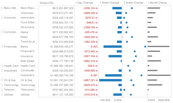
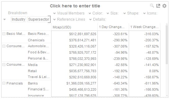
The Table warrants separate explanation; given it itself can display mini-visualizations in each table cell, which are called micro-charts, and unlike other visualizations can display a large number of data variables.
Defining Table Properties
-
Drag the Table to the Dashboard Canvas and release.
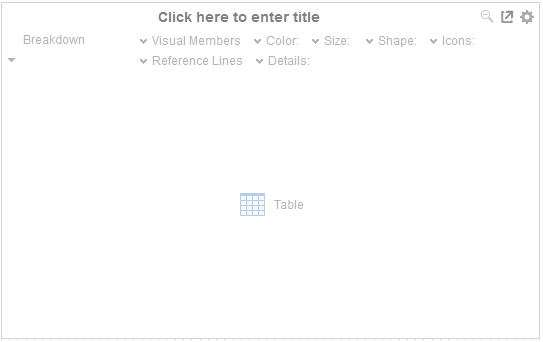
The Table lists:
-
-
Title
-
Settings section
-
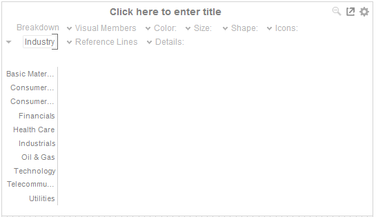
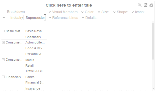
Breakdown Shelf
-
Variables
-
-
Visual Members
-
Color
-
Size
-
Icons
-
Reference Lines
-
-
Details
Each row of the Table is defined by the hierarchy, added to the breakdown. If there are too many rows, a vertical scroll bar will be displayed.
-
-
-
You can add multiple columns to the breakdown. This produces a hierarchical layout.
-
-
You can drag columns from the Data table to the Visual Members Drop area. This creates the columns of the Table.
-
If there are too many columns, a horizontal scroll bar will be displayed.
-
-
Color, Size and Icons are added as with other visualizations.
-
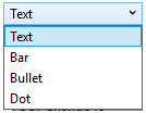
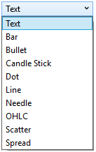
Visual numeric columns can be configured to display either:
For Text visual members:
For Numeric visual members:
-
-
Text presentation of the value:
-
-
-
-
Bar
-
Bullet
-
Dot
-
-
-
-
For time series numeric columns:
-
-
-
-
Text
-
Bar
-
Bullet
-
Dot
-
Candlestick & OHLC
-
Line
-
Needle
-
Scatter
-
Spread
-
-
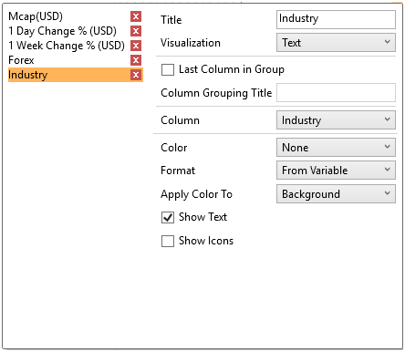
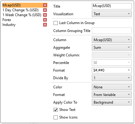
Enter the label for the Visual Member in the Title field. You can parameterize the visual member title to support dynamic schema in the dashboards.
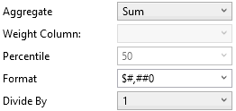
As with all visualizations, the values should have a defined aggregation method.
-
-
If you set the aggregation method to Cumulative Sum, Cumulative Sum By Max, Ratio, Percent of Weight Parent, Percent Weight of Total, Weighted Harmonic Mean, Weighted Mean, or Weighted Sum, the Weight Column drop-down list is enabled that allows you to select the weight column to be used.
-
If you set the aggregation method to Percent of Total Change, the Reference is enabled that allows you to select a reference column to use.
-
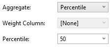
If you set the aggregation method to Percentile, the Percentile drop-down list is enabled and displays a list of values that can be used to calculate the value of the selected percentile. Default is 50.
-
-
Select a field Format. You can also enter a customized format.
Select the Divide By value to divide a number:
-
-
1
-
1000 (by a thousand)
-
10000
-
1000000 (by a million)
-
1000000000 (by a billion)
-
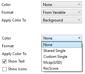
Selecting Show Text determines when the values of a Visual Member are displaying the table.

-
Additionally, the visual column can be configured to display any pre-defined icons.

-
You can also configure to display a selected color variable.
For the rest of the fields in the dialog that are displayed depending on the visualization selected (e.g., Bar, Bullet, or Dot), refer to the corresponding visualization settings sections for more information.
The color can be displayed either as:
-
-
The cell background
-
The cell foreground
-
The By Sign color option is displayed.
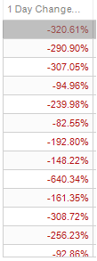
This will color the font in black if a positive number, and red if a negative number.
For numeric fields, you can either display them as:
-
-
From Variable
-
-
-
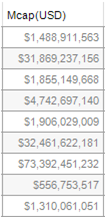
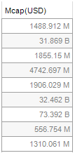
Metric Prefix
-
The values are then displayed as prefixed with the unit symbol (i.e., M or B).
The resulting table can be graphically rich, allowing the visual comparison across multiple different variables.