


|
Horizon Graph Settings
Horizon Graphs are a fantastic way to overview a large number of time series in a limited rectangular space. Since this visualization packs the information in a line graph in 1/6th the space through smart pre-attentive color encoding, it allows for an overview of a large number of time series. Users can scan huge amounts of data points across all relevant time series and immediately identify areas of concern that require closer scrutiny.
Our Horizon Graph visualization is particularly useful when you need to see a large number of time series on a single screen. This makes it easy to compare trends and spot patterns that would be very difficult or impossible to see in a standard report.
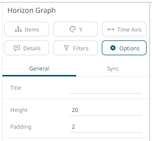
The horizon
graph settings pane is displayed after clicking the Options  button.
|
Setting |
Description |
|
Height |
Specifies the vertical height in pixels for an individual Horizon. |
|
Padding |
Specifies the vertical space in pixels between adjoining Horizons. |
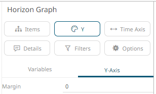
Other visualization-specific properties can be set by clicking on the Y-Axis variable drop area and then selecting the Y-Axis tab:
|
Setting |
Description |
|
Margin |
Margin from the Y axis. |