


|
Stack Graph Settings
Stack Graphs let you visualize quantitative changes to several data sets over time, and you can see how each data point contributes to the total. As with the Treemap the Height of the stack relates Importance, while the color relates Urgency or variance.
Stack Graphs are a great way to look at revenue or gross profit figures over time across several product lines. Stack Graphs are also good to use when you have up to ten or eleven time series data sets to look at, especially for data sets that have a large number of data points.
The stack
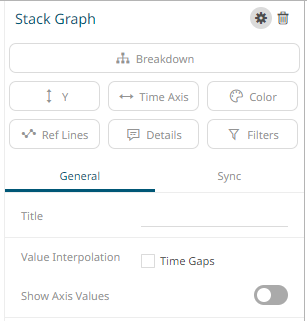
graph settings pane is displayed after clicking the Settings
 icon
or the Visualization Title (i.e., Stack Graph):
icon
or the Visualization Title (i.e., Stack Graph):
|
Setting |
Description |
|
Value Interpolation Time Gaps |
Determines whether time axis gaps (Working Week/Time) are interpolated. |
|
Show Axis Values |
Determines whether the graph coordinates (i.e., X-Y plots, or Date/Time-Y plots) on mouse over are displayed in the visualization. |
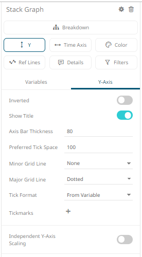
Other visualization-specific properties can be set by clicking on the Y-Axis variable drop area and then selecting the Y-Axis tab:
|
Setting |
Description |
|
Independent Y-Axis Scaling |
Determines whether to have each visualization Y-axis in a cross tab automatically scaled independent of the others. |