


|
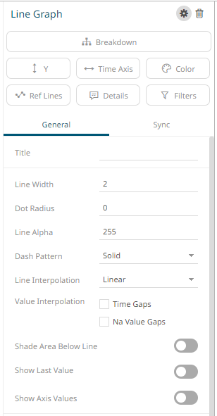
Line Graph Settings
Line Graphs are easy to understand and are a great way to communicate important time-based trends, clustering, and outliers.
They work especially well when comparing ten or fewer data sets (our Horizon Graph is a good solution for displaying time series data with ten or more data sets).
The line graph
settings pane is displayed after clicking the Settings  icon
or the Visualization Title (i.e., Line Graph):
icon
or the Visualization Title (i.e., Line Graph):
|
Setting |
Description |
|
Line Width |
Specifies the line width in pixels. |
|
Dot Radius |
Specifies the radius of each data point in pixels. |
|
Line Alpha |
Specifies the level of color transparency/opacity. The value is from 0 to 255 with the default set to 255. |
|
Dash Pattern |
Specifies the line pattern. Available options are: · Dotted · Dashed · Solid |
|
Line Interpolation |
Specifies whether the line is Stepped, or a Linear Interpolation. |
|
Value Interpolation Time Gaps |
Determines whether time axis gaps (Working Week/Time) are interpolated. |
|
Value Interpolation Na Value Gaps |
Determines whether Na value (or missing) gaps are interpolated. |
|
Shade Area Below Line |
Defines that an alpha shade is applied between the line and the zero Y grid line, if a single line is being displayed. |
|
Show Last Value |
Determines if the flag of the last value will be displayed. Once enabled, the Y-Axis Alignment settings section displays
· Select · Select · Enter the Last Value Margin. Default is 80. · Check the Show Last Value Title box to display the title of the last value in the flag. |
|
Show Axis Values |
Determines whether the graph coordinates (i.e., X-Y plots, or Date/Time-Y plots) on mouse over are displayed in the visualization. |
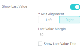
 to
display Y-axis on the left side.
to
display Y-axis on the left side. to
display the Y-axis on the right side.
to
display the Y-axis on the right side.
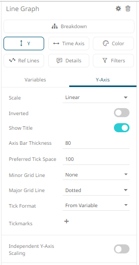
Other visualization-specific properties can be set by clicking on the Y-Axis variable drop area and then selecting the Y-Axis tab:
|
Setting |
Description |
|
Independent Y-Axis Scaling |
Determines whether to have each visualization Y-axis in a cross tab automatically scaled independent of the others. |