|
Scatter Plot Settings
Scatter Plots are used to identify trends, clustering and outliers across a number of numeric variables, especially when investigating large data volumes.
Each scatter point is represented by:
q X Position
q Y Position
q Size
q Color (numeric or categorical)
A line of best fit can also be added to highlight outliers.
Panopticon's Scatter Plot data visualizations are easy to set up and highly customizable. You can configure your display in ways that will make the most sense to you and your users, and users have all the tools they need to filter and manipulate the Scatter Plot to concentrate on the most relevant subsets in the data.
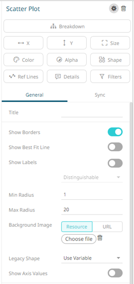
The scatter plot settings pane
is displayed after clicking the Settings  icon
or the Visualization Title (i.e., Scatter Plot):
icon
or the Visualization Title (i.e., Scatter Plot):
|
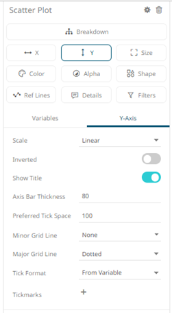
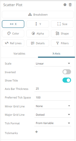
Setting |
Description |
|
Show Borders |
Determines whether a border is drawn around each scatter point. |
|
Show Best Fit Line |
Determines whether a Line of Best Fit is added to the Scatter Plot. |
|
Show Labels |
Determines whether labels will be displayed. If enabled, select how scatter point labels are shown: · Distinguishable · All |
|
Min Radius |
The minimum radius in pixels of the scatter point. |
|
Max Radius |
The maximum radius in pixels of the scatter point. |
|
Background Image |
Defines that a background image is displayed behind the scatter plot. You can either: · click Resource · click URL
|
|
Legacy Shape |
Allows older workbooks to be updated and use the shape variable. Default is Use Variable. Other shapes can also be selected.
|
|
Show Axis Values |
Determines whether the graph coordinates (i.e., X-Y plots, or Date/Time-Y plots) on mouse over are displayed in the visualization. |
 then
Choose File
then
Choose File  and select
the background image in the Open dialog that displays.
and select
the background image in the Open dialog that displays. and
enter the URL of the image file. This value can be parameterized
and use Snapshot, and retrieve the image upon each parameter
value change.
and
enter the URL of the image file. This value can be parameterized
and use Snapshot, and retrieve the image upon each parameter
value change. 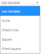
Other visualization-specific properties can be set by clicking on the X-Axis variable drop area and then selecting the X-Axis tab:
Or also, by clicking on the Y-Axis variable drop area and then selecting the Y-Axis tab: