


|
Pie Chart Settings
Pie Charts are one of the oldest and best-known visualizations for displaying contributions to a total.
Panopticon can produce standard Pie Charts in which the pie slice represents a numeric variable that is proportional to the total size of the pie. The color variable can represent either a category or another numeric variable.
Pie Charts can be flat, showing a single set of slices. They can also be hierarchical and display multiple levels of data in a variant called a Multilevel Pie Chart. This is also known as a Sun Burst or a Radial Treemap.
The user can modify the visible depth level and drill into particular slices to investigate further detail.
A recommended alternative to the Pie Chart is the Treemap, which can display a larger number of data points, and is easier to compare constituent data points.
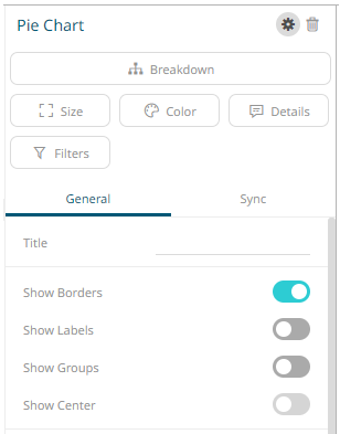
The pie chart
settings pane is displayed after clicking the Settings  icon
or the Visualization Title (i.e., Pie Chart):
icon
or the Visualization Title (i.e., Pie Chart):
|
Setting |
Description |
|
Show Borders |
Determines whether borders are drawn around each pie slice. This is enabled by default. |
|
Show Labels |
Determines whether labels are displayed within each pie slice. |
|
Show Groups
|
Determines whether a multilevel Pie Chart (or Sun Burst) is displayed, where each hierarchy level is represented in a nested group. |