


|
Working with Load Plan Visualization
Load plan visualization is a new functionality available in Data Prep Studio that provides users with a hierarchical view of all of the operations performed on a table. This functionality allows users to easily track, modify, remove, and duplicate tables, especially those obtained through Transform Data and Combine operations.
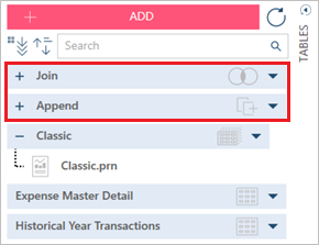
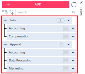
In the table list below, for example, the tables Append and GroupBy are the result of append and transform operations, respectively.
In previous versions of Data Prep Studio, if you were to rename these tables, all information regarding their data sources and the operation(s) performed to achieve the final table would be lost. Thus, should you wish to recreate the table at a later time, you would be unable to do so.
Load plan visualization addresses this issue by marking joined, appended,
or transformed tables with a  sign to the left of
the table name and identifying the operation performed to its right [e.g.,
sign to the left of
the table name and identifying the operation performed to its right [e.g.,
 (append),
 (transform)].
Clicking on the sign reveals the data sources of
our tables of interest:
If we were to transform the table Append by grouping data, the resulting table will display on top of the Accounting, Data Processing, and Append tables.
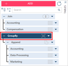
Thus, users are provided with a hierarchical view of all of the operations performed on a table; here, the most recent table is displayed at the top of the tree.
Note that the first tables obtained through join, append, or transform operations are respectively named Join, Append, and <TransformationApplied> by default. The next tables obtained through these operations are sequentially named Join(1), Append(1), and <TransformationApplied(1)>.