HG-1000: Plot XY Data
In this tutorial, you will learn how to plot XY data.
- Plot curves from files.
- Plot multiples curves in one window.
- Plot multiple curves in multiple windows.
- Use the Advanced Plot Options dialog to change the curve and plot attributes.
The Build Plots panel allows you to construct multiple curves and plots from a single data file. Curves can be overlaid in a single window or each curve can be assigned to a new window.
The Advanced Options feature on the Build Plots panel allows you to apply many options at once to the session during plotting. Curves created in this manner are added to the session in a new layer.
The Multiple File Plotting dialog allows you to select multiple files with intersecting data (for example, multiple runs of a particular test) and plot the data from all files simultaneously in the current HyperGraph session.
Open the demo.dat File
- From File menu, select to clear all contents in the HyperGraph session.
-
Verify XY Plot is selected from the plot type menu,
 .
.
-
Click the Build Plots icon,
 .
.
-
Click the Open File button,
 , and select the demo.dat file, located in the plotting folder.
Build Multiple Curves on a Single Plot
-
Under Y Request:, click the expansion button,
 , to easily view the Y Request list.
-
Click Apply to create the curves on page 1.
The plot’s X axis is labeled Time (the X type), while the y axis is labeled Force (the Y type). The plot’s title is X (the Y Component name). The curve’s names are the Y Request names.
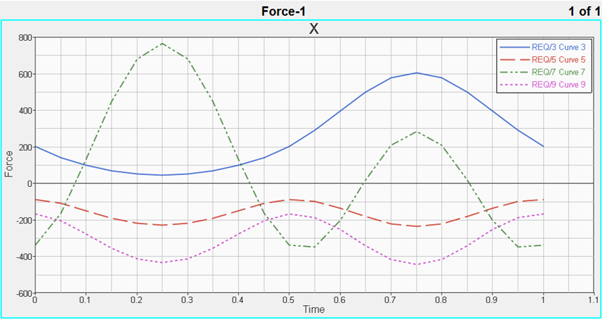
Figure 2.
Build Multiple Curves on Multiple Plots
While in the Build Plots panel, do the following:
-
Click the Page Layout button,
 , and select the four-window layout from the panel
area.
, and select the four-window layout from the panel
area.
-
Click Apply to create the plots and curves on page
2.
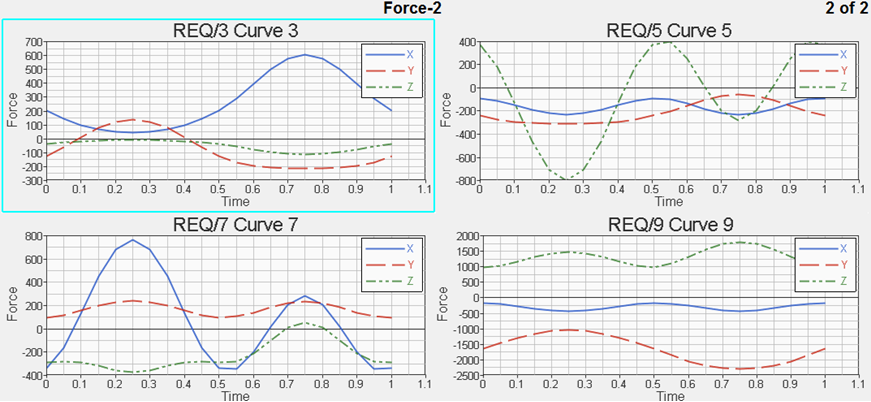 Figure 3.
Use Advanced Options to Change the Curve and Plot Display Attributes
While in the Build Plots panel, do the following:
-
Click in the Font field on the right side of the dialog. Next, click the Font
icon,
 , to display the Font dialog. Change the font size to
16.
, to display the Font dialog. Change the font size to
16.
-
Select Horizontal Axis from the left side of the dialog.
Click in the Font field on the right side of the dialog.
Next, click the Font icon, , to display the Font dialog.
You can also perform filtering on the curve. For this, retain the curve and plot modifications you just performed.
-
From Define Curves panel,
 , you will see the filter you applied display in the y
vector field:
, you will see the filter you applied display in the y
vector field:
Use Multiple File Plotting to Plot Multiples Curves in One Plot
-
Verify XY Plot is selected from the plot type menu,
 .
.
-
Click the Build Plots icon, .
-
Next to Data File, click the Multiple File Selection icon,
 .
The Multiple File Plotting dialog is displayed.
.
The Multiple File Plotting dialog is displayed. -
Next to Select directory, click the Open File button, , and select the MultipleFiles
folder, located in the plotting folder.
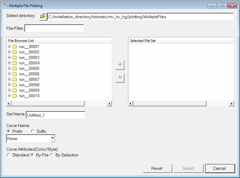 Figure 4.
 -
You can expand the folders in the File Browser List to display the files
contained in each folder.
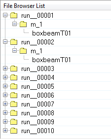 Figure 5.
 You can select files from the File Browser List and click the arrow,
 , to move them to the Selected File
Set. For this tutorial, we will filter them.
, to move them to the Selected File
Set. For this tutorial, we will filter them. -
In the File-Filter field, enter *T01 and press Enter. The following files are displayed:
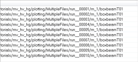 Figure 6.
 -
While holding the Ctrl button, select the first eight
files listed under File Browser List and click the right-facing arrow, , to move them to the Selected File
Set.
-
Under Curve Name, leave Prefix activated and select Directory Level
2 from the drop-down menu.
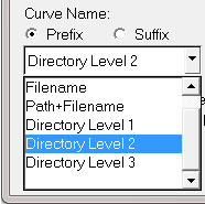 Figure 7.
 -
Click the Page Layout button, , and select the two-window layout from the panel
area.
-
Click Apply.
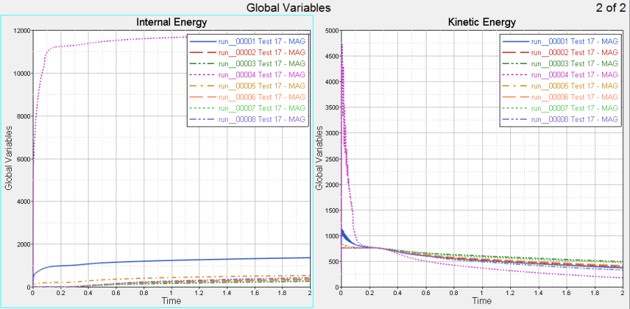 Figure 8.
 -
You can also view the curve Label Prefix and Label information in the Plot
Browser. These fields were edited using the Advanced Options dialog in Step
4.
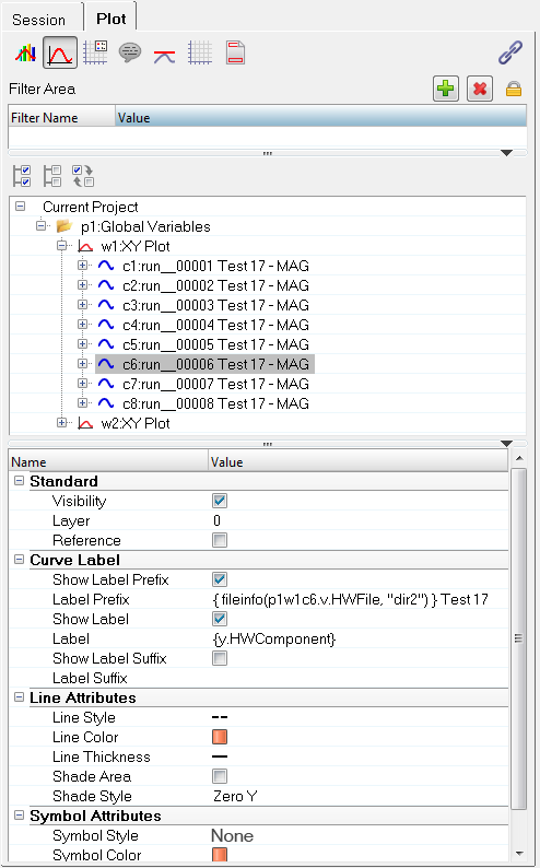 Figure 9.