|
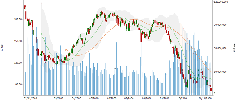
Timeseries Combination Graph
The Time Series Combination Graph, combines a series of time series visualizations as individual layers of the total display. As a consequence more complex time series visualizations can be built from the “base” visuals.
Each visual can be assigned to either the left or right Y axes, allowing multiple scales to be represented.
For example the following visualization includes:
-
Candle Stick Graph – Showing the distribution of prices (OHLC)
-
Line Graphs – Showing moving averages of the closing price
-
Needle Graph – Showing traded volume across the period
-
Spread Graph – Showing a price band across the period
Each of the visuals has a defined “Z” order, which in this case places from back to front: Spread, Needle, Candle Stick, Line