


|
Time Series Scatter Plot
Time Series Scatter Plots display time-based transactions, similar to the Needle graphs. Like the scatter plot, it displays individual data points (or transactions), with a given numeric Y value and a given timestamp X value.
Common uses include displaying transaction volume across time relative to the price at which the volume was executed, and displaying order book depth across time.
Typically, the graph is combined with line graphs to show the scatter points relative to defined boundaries.
Figure 2 shows trade volumes and prices relative to the best bid and offer across time.
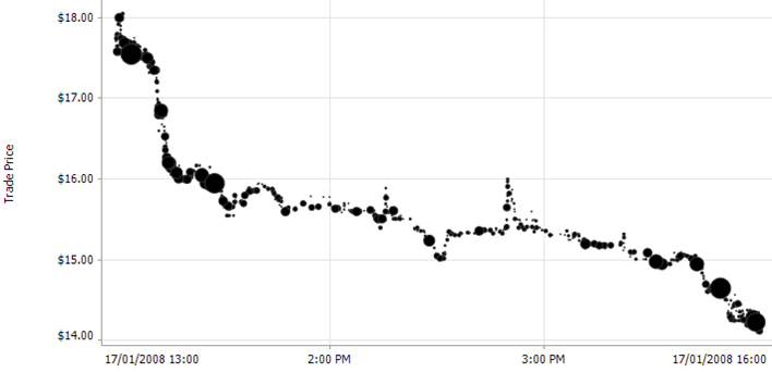
Figure 1. A time series scatter plot
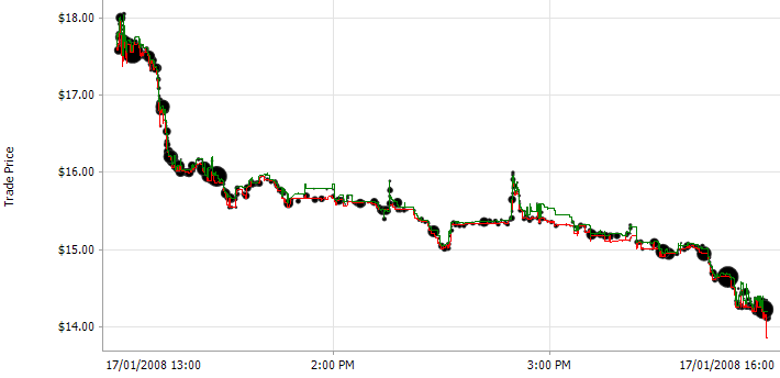
Figure 2. A time series scatter plot (i.e., Trade volume with best bid and offer)
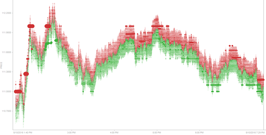
Figure 3. A time series scatter plot (Top 20 Levels of Order Book)