


|
Stack Graph
Stack Graphs let you visualize quantitative changes to several data sets over time, and you can see how each data point contributes to the total. As with the Treemap the Height of the stack relates Importance, while the color relates Urgency or variance.
Stack Graphs are a great way to look at revenue or gross profit figures over time across several product lines. Stack Graphs are also good to use when you have up to ten or eleven time series data sets to look at, especially for data sets that have a large number of data points.
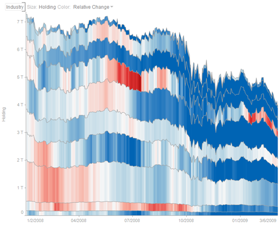
Figure 1. A portfolio stack graph
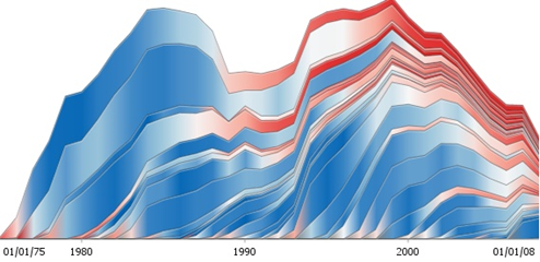
Figure 2. An oil production stack graph