


|
Scatter Plot
Scatter Plots are used to identify trends, clustering and outliers across a number of numeric variables, especially when investigating large data volumes.
Each scatter point is represented by:
-
X Position
-
Y Position
-
Size
-
Color (numeric or categorical)
A line of best fit can also be added to highlight outliers.
Panopticon Designer (Desktop)'s Scatter Plot data visualizations are easy to set up and highly customizable. You can configure your display in ways that will make the most sense to you and your users, and users have all the tools they need to filter and manipulate the Scatter Plot to concentrate on the most relevant subsets in the data.
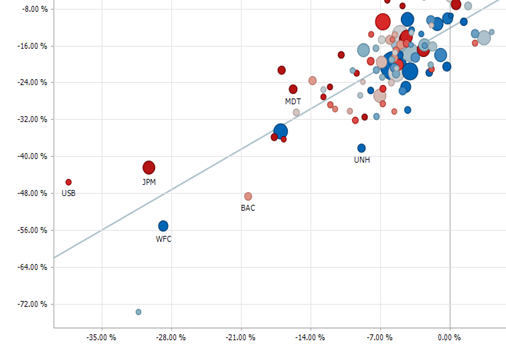
Figure 1. A scatter plot with line of best fit
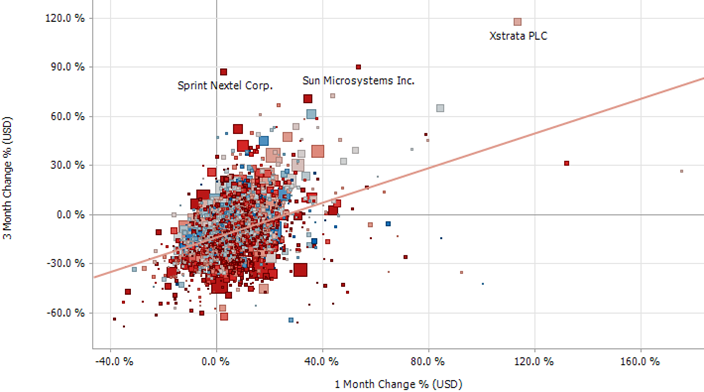
Figure 2. A scatter plot with square scatter points