


|
Pie Chart
Pie Charts are one of the oldest and best known visualizations for displaying contributions to a total.
Panopticon Designer can produce standard Pie Charts in which the pie slice represents a numeric variable that is proportional to the total size of the pie. The color variable can represent either a category or another numeric variable.
Pie Charts can be flat, showing a single set of slices. They can also be hierarchical and display multiple levels of data in a variant called a Multilevel Pie Chart. This is also known as a Sun Burst or a Radial Treemap.
The user can modify the visible depth level and drill into particular slices to investigate further detail.
A recommended alternative to the Pie Chart is the Treemap, which can display a larger number of data points, and is easier to compare constituent data points.
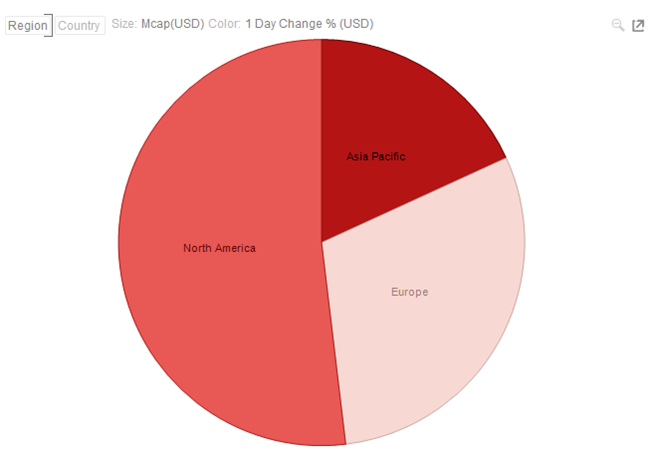
Figure 1. A typical pie chart
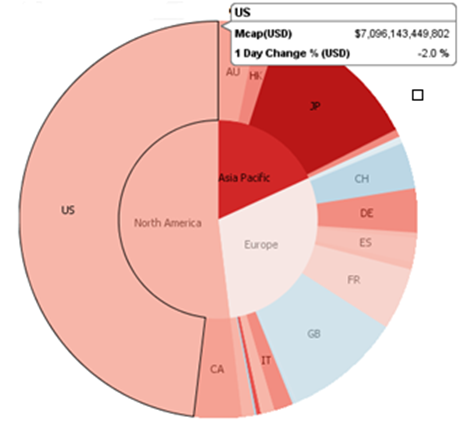
Figure 2. A multilevel pie chart (Sun burst)

Figure 3. A multilevel pie chart with deeper hierarchy