


|
Highlighting the Latest Data in Real Time Streaming Connectors
In the real time streaming connectors, there is an option to force flushes, so that output dashboards can visually highlight the latest and age of data and present whether they are stale or not.
Color is used to highlight when an item has changed. Follow the steps below to on how to configure the visualization of age in real time streaming connectors.
Highlighting the Latest Data
-
Open a streaming connector and define the connection details.
-
Check the Add Last Update Time and Age box.
-
Click OK to confirm the selection and retrieve the record set into Panopticon Designer.
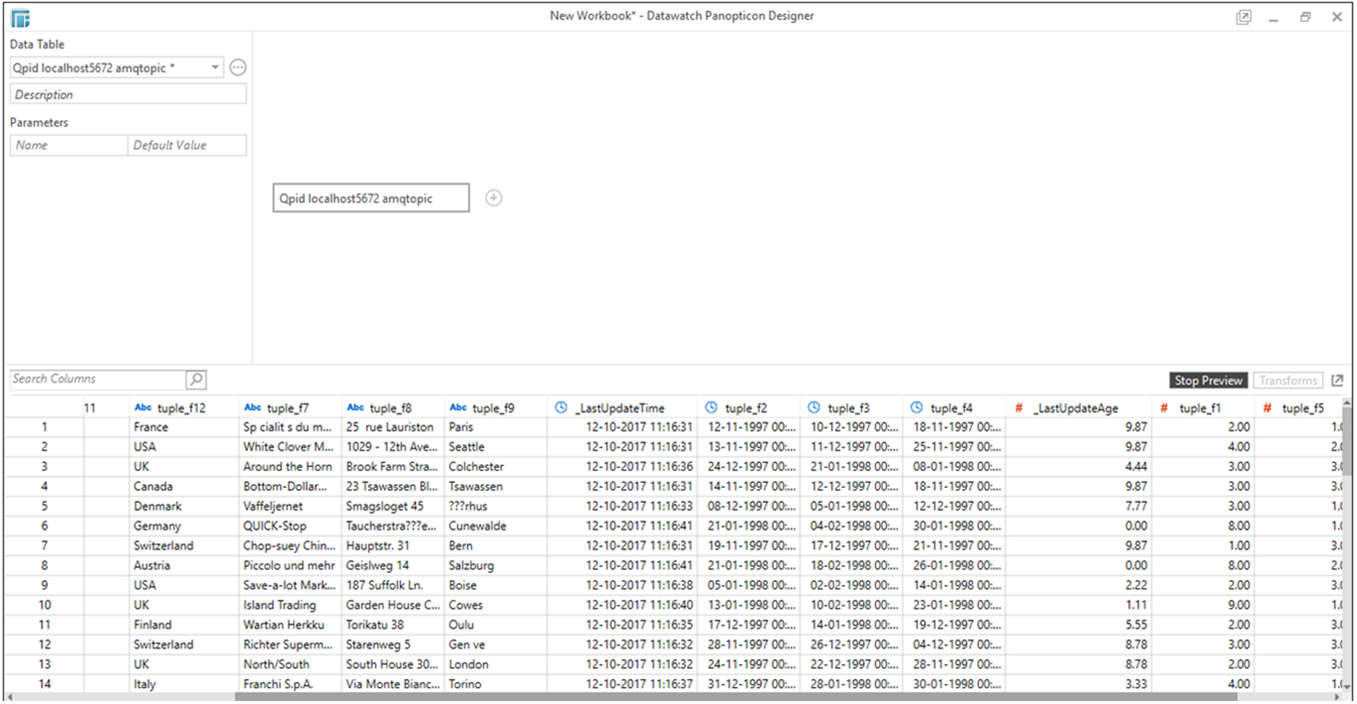
In the Data Source Preview window, two columns are added:
-
_LastUpdateTime (Date/Time column which updates on all rows that were inserted or updated)
-
_LastUpdateAge (Numeric column which represents the seconds since rows were last touched in a flush. This is updated on all rows.)
For example:
In this Table visualization, the highlight is defined for tuple_f1 with _LastUpdateAge column used for the color settings.
-
Click OK to close the Data Source Preview and display the Workbook layout.
-
Add a visualization and select the column/s that will have the color highlight.
Example:
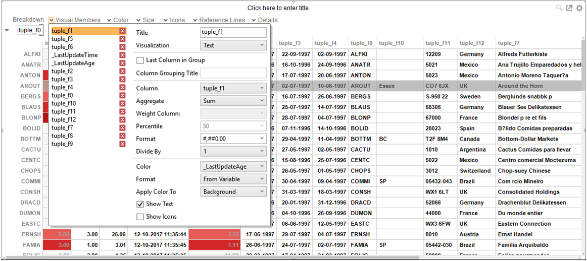
In this Table visualization, the highlight is defined for tuple_f1 with _LastUpdateAge column used for the color settings.
-
To define the color settings, select _LastUpdateAge under the Color variable list.
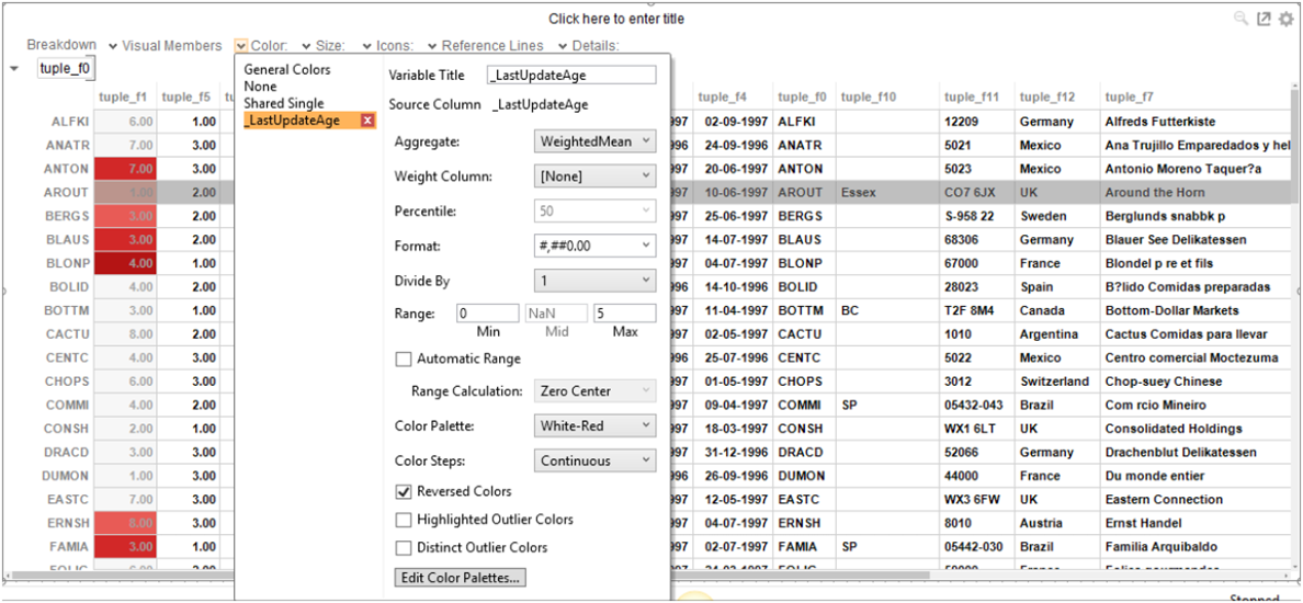
In the example above the Range is 0 (Min) to 5 (Max) seconds with the color palette White-Red and the colors are Reversed. This means that when the _LastUpdateAge value is updated, the background color of the tuple_f1 row will be red and will fade to white over the next 5 seconds.
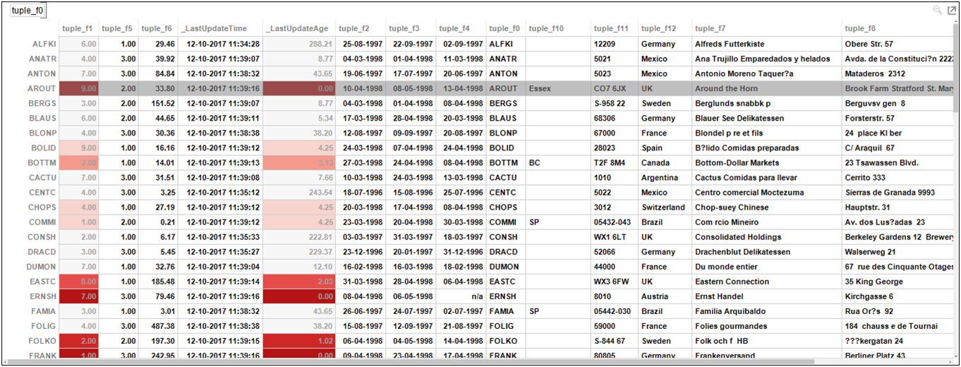
You can then easily view whether the data
are updated or stale.