


|
Candlestick Graph
Candlestick graphs are a traditional financial visualization for display of time-based price distributions. Specifically, for each time slice, they display:
-
Opening Price
-
Highest Price
-
Lowest Price
-
Closing Price
The Candle is filled if the closing price is lower than the open and empty if the closing price is higher than the open.
The vertical line (or candle wick) displays the range of traded prices across the period.
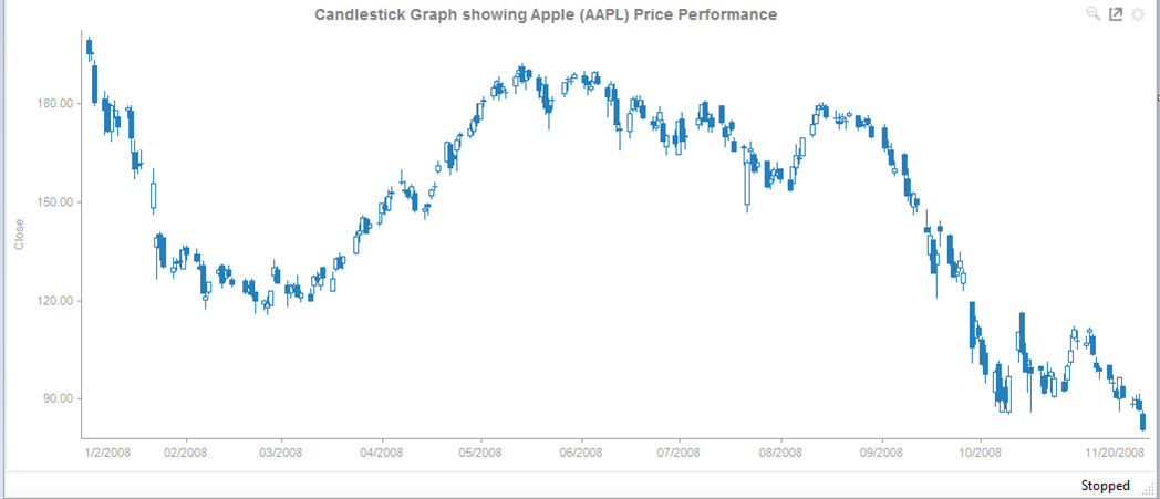
Figure 1. A candle stick graph

Figure 2. Close up of data points in a candle stick graph