


|
Action Text Box
The Action Text Box allows your users to submit free-text input values for a parameter associated with the Action Text Box. It can also be used for entering password parameters.
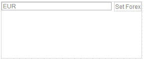
The currently applied parameter value will be displayed in the action text box.
Adding Action Text Box
-
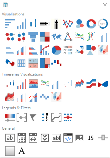
Draw a rectangle on the dashboard canvas to display the Parts dialog.
-
Click the Action Text Box
 icon in the General section of the Parts
dialog.
icon in the General section of the Parts
dialog.
The Action Text Box part is displayed in the dashboard canvas. By default it shows an empty input field and a button with the text Update Settings.
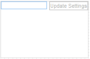
NOTE: If a parameter is defined in the data source, it is displayed in the Action Text Box.
-
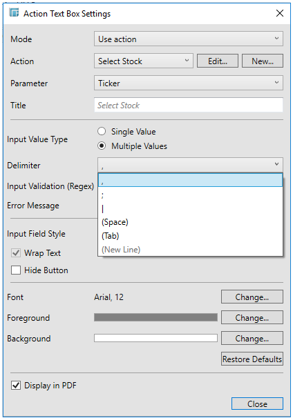
Select the newly added text box and click Settings. The Action Text Box Settings dialog displays.
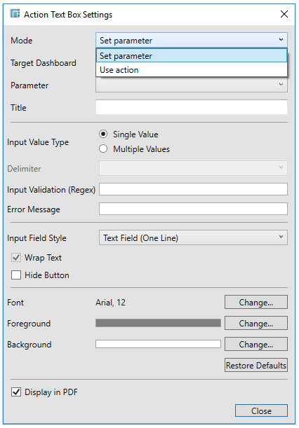
There are two Mode options for defining settings for Action (i.e., Use Action) and Parameter (i.e., Set Parameter).
-
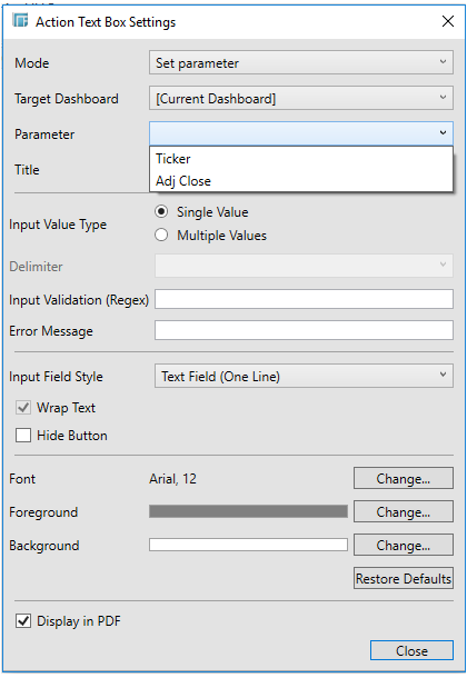
If Set Parameter is selected, select the Target Dashboard. Otherwise, proceed to step 5.
The default is Current Dashboard. When copying the Action control to another dashboard or workbook, the target dashboard is automatically set to the new dashboard instead of where it was originally located.
This populates the Parameter list of the parameters that are defined in the selected target dashboard.
Proceed to step 6.
-
If Use Action is selected, select an action to be used by the control.
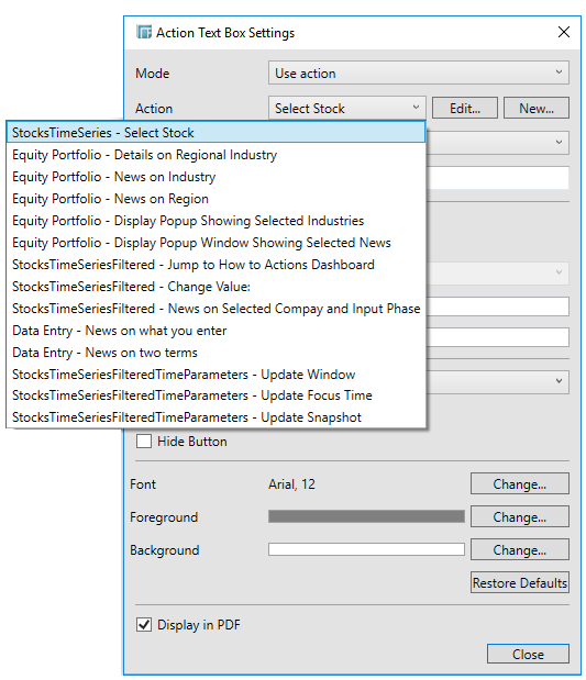
You can also either click the:
-
-
Edit button to modify the Action settings or
-
New button where you can create a new Action if needed, and then use that.
-
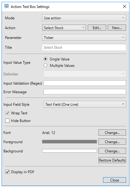
This populates the Parameter drop-down list of the parameters defined in the selected action. Also, the name of the action is displayed in the Title box.
-
Select the Parameter that will be updated by the text box.
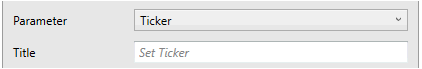
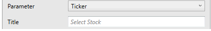
If the Mode is Set Parameter, the Title box will display Set <Parameter>. For example:
If the Mode is Use Action, the Title box will display Set <Action Name>. For example:
-
Select an input mode: Single Value or Multiple Values.
If the Input Value Type selected is Multiple Values, you can opt to select e Delimiter character:
-
Add a custom Input Validation. This can be any regular expression (e.g., "A-Z{3}").
-
The parameter will not be updated unless it passes the validation. Enter an Error Message to help in defining a better input in the Action Text Box.
-
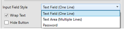
Select the Input Field Style: Text Field (One Line) or Text Area (Multiple Lines), or Password.
-
Activate or deactivate Wrap Text. NOTE: This applies to Text Area.
-
Check the Hide Button box for the action control to update the parameter whenever the value of the Text Box changes.
-
To modify the style settings of the Action Text Box, make the necessary changes in the following controls:
-
-
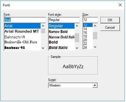
Font - Click Change to display the Font dialog where you can set the Font Type, Style, Size, and Script.
-
-
-
Foreground - Click Change to display the Color dialog and set the Foreground color.
-
Background - Click Change to display the Color dialog and set the Background color.
You may opt to click Restore Defaults to revert to the default style settings.
-
-
Check the Display in PDF box to include this dashboard part in the PDF output.
-
Click Close.
The resulting action control is displayed on the dashboard canvas.