


|
Action Dropdown
The Action Dropdown allows the selection of the parameter value that will be used by the action.
Adding Action Dropdown
-
Draw a rectangle on the dashboard canvas to display the Parts dialog.
-
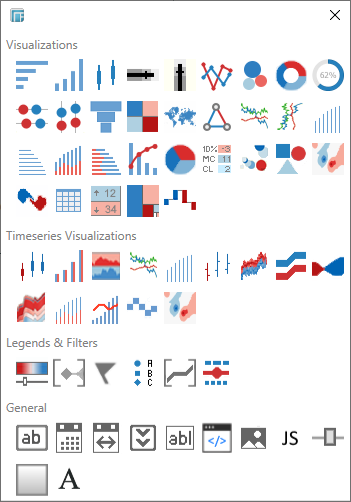
Click the Action Dropdown
 icon in the General
section of the Parts dialog.
icon in the General
section of the Parts dialog.
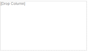
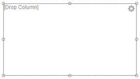
The action dropdown part is displayed in the dashboard canvas.
By default it appears empty except for the words Drop Column.
-
Select the newly added dropdown and click Settings.
The Action Dropdown Settings dialog displays.
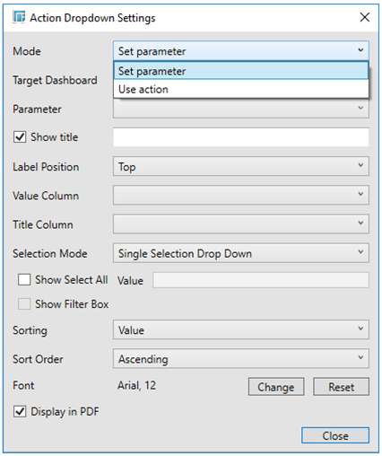
There are two Mode options for defining settings for Action (i.e., Use Action) and Parameter (i.e., Set Parameter).
-
If Set Parameter is selected, select the Target Dashboard. Otherwise, proceed to step 5.
The default is Current Dashboard. When copying the Action control to another dashboard or workbook, the target dashboard is automatically set to the new dashboard instead of where it was originally located.
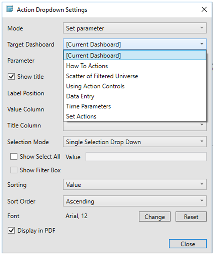
This populates the Parameter drop-down list of the parameters that are defined in the selected target dashboard. Proceed to step 6.
-
If Use Action is selected, select an Action to be used by the control.
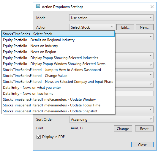
You can either click the:
-
-
Edit button to modify the Action settings or
-
New button where you can create a new Action if needed, and then use that.
-
This populates the Parameter drop-down of the parameters defined in the selected action.
-
Select the Parameter that will be updated by the drop-down.
-
Check the Show Title box to display the Title in the drop-down.
-
Select the Label Position: Top or Left.
-
Select a Value Column.
-
Select a Title Column.
-
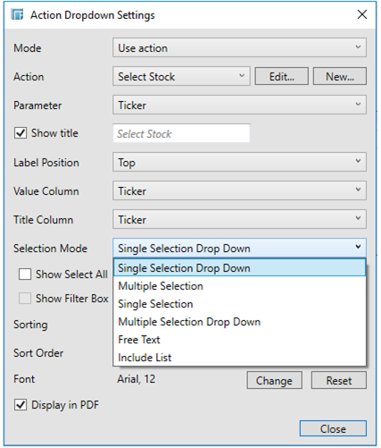
Select a mode of selection:
-
-
Single Selection List
-
Single Selection Drop Down List
-
Multiple Selection List
-
Multiple Selection Drop Down List
-
Free Text
-
Include List
-
-
Check the Show Select All box to allow selection of all items. Consequently, this causes an array of parameter values to be passed to the action or auto parameterization.
-
In the Value box, enter the value that will be passed as the parameter when the Select All box is checked.
If left blank, a list of all values will be passed instead.
-
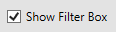
For Multiple Selection or Multiple Selection Drop Down selection mode, the Filter Box option can either be shown or hidden.
-
For sorting, select either Value or Title. If you did not select a Title Column, the Sorting drop-down is disabled and the Value Column is automatically used for sorting.
-
Optionally, specify a sorting mode for the values: Ascending, Descending, or None.
NOTE: The Sort order setting is based on “Sorting” + Value/Title dropdown and “Order” + Ascending/Descending.
-
Click Change to display the Font dialog where you can set the new Font Type, Style, Size, and Script.
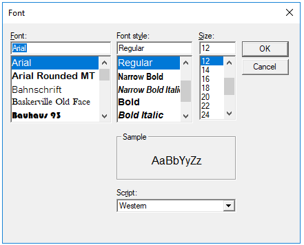
Click Reset to revert to the default Font settings.
-
Check the Display in PDF box to include this dashboard part in the PDF output.
-
When you have made your settings, click the Close button.
The Action Dropdown is now linked to the action, but is not yet populated with value options. As a consequence it is disabled and has the same appearance as when you had not made any settings.
-
To be able to populate the Action Dropdown with values to select from, do the following:
In the data tables list on the left side of Panopticon Designer (Desktop), select the data table that lists the values to populate the list box.
-
Select the appropriate column from a data table, and drag it onto the Acton drop list.
The Action Dropdown is now complete, and consequently enabled.
The initial value is not set, as no action has yet been applied.
Expanding the drop list displays the list of unique values retrieved from the selected column that was dragged onto the drop-down.
Depending on the selection node, the list of options will be displayed accordingly:
-
-
Single Selection List
-
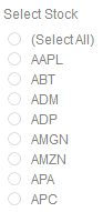
-
-
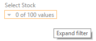
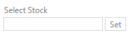
Single Selection Drop Down List
-

-
-
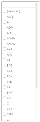
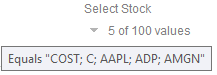
Multiple Selection List
-

When the Show Filter Box option is enabled, as shown above, the list can be filtered by entering text in the Filter box.
-
-
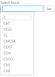
Multiple Selection Drop Down List
-
When the Show Filter Box option is enabled, as shown above, the list can be filtered by entering text in the Filter box.
NOTE: Hovering on an active Multiple Selection Drop Down List filter displays the current selected values.
-
-
Free Text
-
When entering a value, matches are displayed allowing you to pick one from the list. You can do so by double-clicking on it.
The list displayed is limited to 10 items.
-
-
Include List
-
This is only available in the Web client. This filter allows to include a set of values from a given column. It consists of a Free Text filter used for finding values to include and a list of values that are currently used in the filter.
NOTE:
-
The search bar is the same as the Free Text filter such that only 10 items that match the current search setting are loaded.
-
There is no Select All option. When there is no value, this means no filtering will be done in the Include mode.
Selecting a value will execute the action, passing the selection as a new value to the parameter.
NOTE: Multiple value selection mode is not suitable for URL Actions or for Script Actions.
Nor is it suitable for Navigation Actions that point to another dashboard.
The Action drop-down list will be displayed with an associated scroll bar if required.