


|
Populating Global or Dashboard or Specific Filter Boxes
Populating Filter Boxes
-
To add a new filter to the Filter Box, simply drag and drop a column from the Data Table list on the left side of the screen to the Filter Box.
As you drag the column over the Filter Box a draft representation of the filter is presented in gray.

-
Drop the column on the Filter Box to add.
Filters can be one of the following types:
-
-
Categorical
-
-
-
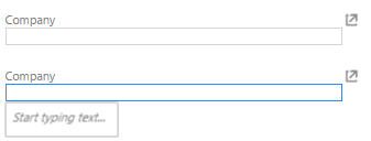
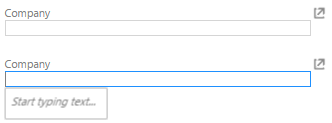
Free Text Entry
-
Shows a free text entry box.
-
-
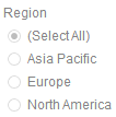
Single Selection List
-
-
-
-
Single Selection
-
-
Shows a list of distinct items that are alphabetically sorted. Only a single item or all items may be selected.
-
-
-
Single Selection Drop Down List
-
-
Shows a list of distinct items that are alphabetically sorted when expanded.
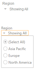
Only a single item or all items may be selected. When collapsed, it shows the summary text or the single selected item. For the example below, the region selected is Europe.

NOTE: In the Web Client, the summary text is based on the generated predicate and not on the data selected in Panopticon Designer (Desktop). Therefore, if the selected item is deleted in the data source, the summary text will still have a value in the Web Client.
-
-
Multiple Selection List
-
Shows a list of distinct items that are alphabetically sorted. Multiple items may be selected.
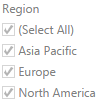
NOTE: The default selection mode when the Text filter column has 0 to 15 values.
-
-
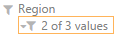
Multiple Selection Drop Down List
-
Shows a list of distinct items that are alphabetically sorted when expanded.
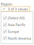
Multiple items may be selected. When collapsed shows the number of selected items.
NOTE:
-
Hovering on an active Multiple Selection Drop Down List filter displays the current selected values.
-
The default selection mode when the Text filter column has 16 to 30 values.
-
-
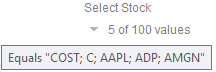
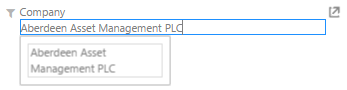
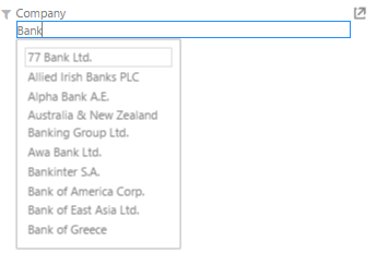
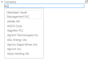
Free Text
-
-
Shows a free text entry box.
-
-
-
When entering a value, matches are displayed allowing you to pick one from the list. You can do so by double-clicking on it.
The list displayed is limited to 10 items.
-
-
-
-
-
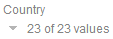
NOTE: The default selection mode when the Text filter column has more than 30 values.
-
-
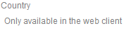
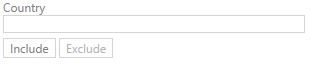
Include/Exclude List
This is only available in the Web client. This filter allows to include or exclude a set of values from a given column. It consists of a Free Text filter used for finding values to include or exclude and a list of values that are currently used in the filter.
NOTES:
-
The search bar is the same as the Free Text filter such that only 10 items that match the current search setting are loaded.
-
There is no Select All option. When there is no value, this means no filtering will be done in both the Include or Exclude mode.
In the Panopticon Designer (Desktop):
In the web client:
-
-
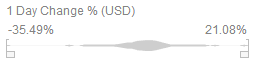
Numeric Range
-
Shows the distribution plus minimum and maximum limits.
-
-
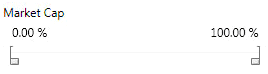
Percentile Range
-
Converts the numeric range into a percentile distribution.
-
-
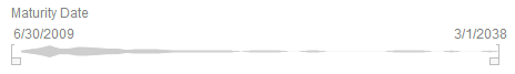
Date/Time Range
-
Date Range Filters use the absolute values contained in your database. They show the distribution curve for your data along with the range from the lowest to the highest value in your data set.
They operate in a similar manner to Numeric Range Filters.