The world is exploding with data where sensors may be capturing data every second. However, to derive meaning out of the data, we must aggregate the data in several different ways. Only after aggregating the data can we truly understand the trends and outliers to make informed decisions.
Envision ensures that the underlying complexities are transparent, and allows you to perform 'on-the-fly' aggregations and set up multi-level aggregations to provide tremendous insight into large data sets. You can perform a multi-level aggregation when you need to combine data from different levels of aggregation. The data is then sent from the inner level to the higher level by combining the aggregated data at each level.
Scenario 1
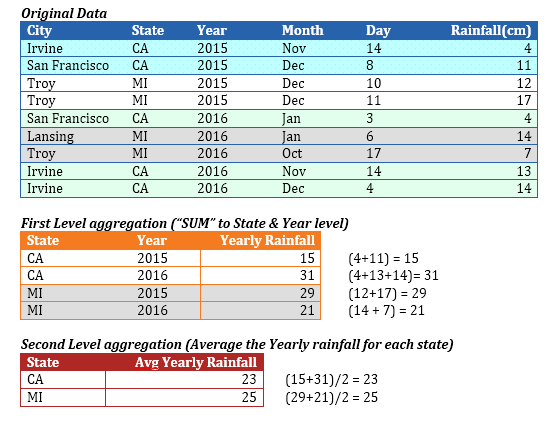
A typical scenario where multi-level aggregation is required is when you want to roll up to level 'A' using a certain aggregation function, and then further roll up to level 'B' using a different aggregation function. For example, if you have the data of the daily rainfall data of every city in the USA and you want to compute the average yearly rainfall of each state.
In this example, we must reduce the blue table to the red table. In order to do so, we must generate the intermediate orange table.
1. Roll up the rainfall data (by using SUM) at the 'State' and 'Year' level. Once we have this rolled up data, we further roll up the data (by applying AVERAGE) to obtain the average yearly rainfall of each state.
2. Drag and drop 'State' as the X-Axis dimension (which defines the aggregation level of the chart).
3. Use 'Average' as the aggregation function, and drag and drop a derived measure whose formula is as follows:
SUM([Rainfall], [Year], [State])
Since the aggregation function (SUM) is used in the formula, Envision generates the intermediate 'orange' table by applying the aggregation defined in the above formula.
· The 1st level aggregation of 'Rainfall' is performed (by using SUM as the aggregation function) up to the Year & State level.
· The 2nd level aggregation is performed (by using 'Average' as the aggregation function) up to the aggregation level of the chart (which is 'State').
· The intermediate aggregation level must include the chart’s aggregation level(s).
· The red table’s level is 'State'. The orange table must contain 'State' as one of its levels. Otherwise, you cannot roll up from the orange table to the red table.
· If the pre-aggregation formula does not include the (final) chart’s aggregation level(s), they are added implicitly. Hence, the 3rd argument ([State]) in the derived measure’s formula is redundant, and the formula could have been: SUM([Rainfall], [Year]).
· Envision implicitly creates the intermediate orange tables (on-the-fly) if the measure’s formula involves an aggregation function. If the formula involves multiple nested aggregations, multiple levels of the orange tables are implicitly created.
Scenario 2
Let us look at more complex scenarios in the rainfall data set where the intermediate table is merged back with the original 'Fact' table. Assuming that you want to compute the maximum percentage of the yearly rainfall that any single day has received in each state, you must create a derived dimension whose formula is as follows:
[Rainfall] / SUM([Rainfall], [Year]) * 100
· This will be used as the measure with the aggregation type set to 'MAX'. This formula would require information from the blue table, viz. Rainfall, and orange table, viz. SUM([Rainfall], [Year]).
· The orange table is merged back onto the blue table (as shown) to create an extended blue table, and the red table is generated by performing the 2nd level aggregation on the extended blue table.
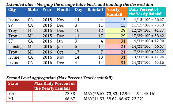
As you can extrapolate from this example, it is possible that multiple intermediate (orange) tables may be generated, and one orange table may be required to merge back onto another orange table to arrive the final red table. Envision handles all combinations of merging one intermediate table onto another intermediate table and/or the original table based on the underlying formula that includes aggregation functions.
The following examples comprise formulas that demonstrate multi-level aggregations, and the intermediate tables that Envision generates in each case.
Example 1
[Revenue] / SUM([Revenue], [Year])
The components of the formula are:
· [Revenue] which comes from the original Fact table.
· SUM([Revenue], [Year]) will result in an intermediate table of level [Year] (and the chart level).
Based on the components of the above formula, the two relevant tables are the original Fact table and the intermediate table of level [Year, <Chart Level>]. The intermediate table will be merged onto the original Fact table and then (finally) aggregated to the chart level.
The highest granularity table was the original Fact table, and any intermediate table is a subset of the original Fact table.
SUM([Revenue], [Year], [Month]) / SUM([Revenue], [Year])
The components of the formula are:
· SUM([Revenue], [Year], [Month]) will result in an intermediate table of level [Year, Month, <Chart Level>].
· SUM([Revenue], [Year]) will result in an intermediate table of level [Year, <Chart Level>].
After the intermediate tables are calculated, this formula has no other reference to the original Fact table. Hence, these two intermediate tables do not require to be merged back with the original Fact table. However they still need to be merged.
The intermediate table with lower granularity will be merged onto the table with higher granularity.
The [Year, <Chart Level>] table has lower granularity than the [Year, Month, <Chart Level>] table. Hence, the [Year, <Chart Level>] will be merged on to the [Year, Month, <Chart Level>] table before finally aggregating to the chart level.
E Example 3
SUM([Revenue], [Year], [Region]) / SUM([Revenue], [Year]) / SUM([Revenue], [Region])
The components of the formula are:
· SUM([Revenue], [Year], [Region]) will result in an intermediate table of level [Year, Region, <Chart Level>]
· SUM([Revenue], [Year) will result in an intermediate table of level [Year, <Chart Level>]
· SUM([Revenue], [Region]) will result in an intermediate table of level [Region, <Chart Level>]
Here, three intermediate tables are involved. The table with the highest granularity is the [Year, Region, <Chart Level>] table. The granularities of the other two tables are a subset of this table’s granularity. Therefore, the [Year, <Chart Level>] table and the [Region, <Chart Level>] will each be merged with the [Year, Region, <Chart Level>] before the final aggregation to the chart level.
The granularities of the other two tables are not subsets of each other. It is only important that the granularities of all the intermediate tables are subsets of the 'highest granularity' table (because each of them need to be merged independently onto the 'highest granularity' table).
Syntax
SUM([Revenue], [Year]/ SUM([Revenue], [Region])
The components of the formula are:
· SUM([Revenue], [Year]) will result in an intermediate table of level [Year, <Chart Level>].
· SUM([Revenue], [Region]) will result in an intermediate table of level [Region, <Chart Level>].
It is not possible to ascertain the table which has higher granularity, and the granularities of the tables are not subsets of each other and will hence result in a formula error.
Intermediate table with granularity lower than the chart level
If you are trying to plot the percentage monthly revenue, then you need to aggregate for each month (month will be the chart level here), the ratio of the revenue to the total revenue (across all months). Here, we want the denominator to be of granularity that is lower than the chart’s final level.
Envision supports this by introducing an artificial argument called '-1' in the following formula:
E Example 1
[Revenue] / SUM([Revenue], -1)
The components of the formula are:
· [Revenue] which comes from the original fact table
· SUM([Revenue], -1) which will result in an intermediate table of the lowest granularity (a single number) – this may still not be a single number if a legend dimension is involved.
Again, the lower granularity table will be merged with the higher granularity table before the final aggregation is performed at the chart level.
E Example 2
SUM([Revenue], -1)
· Here, the only intermediate table generated is the lowest granularity table (whose granularity is lower than the chart’s level).
· This needs to be finally aggregated (second-level aggregation) to the chart’s level, which is now not possible to achieve, and hence the formula is an error. In other words, there has to be at least one component in the formula whose level is >= the chart’s level, else the final aggregation to the chart’s level cannot be achieved.